Packaging
Nestle is Naturally good
August 14, 2012 - by Kory Grushka


If you read our blog, you can see that there are a lot of current trends between green packaging design, clean packaging, promoting healthy habits and so on. With that said, this new product from Nestle fits right in. A healthy habit that Nestle is pushing is natural tastes, without preservatives and food coloring.
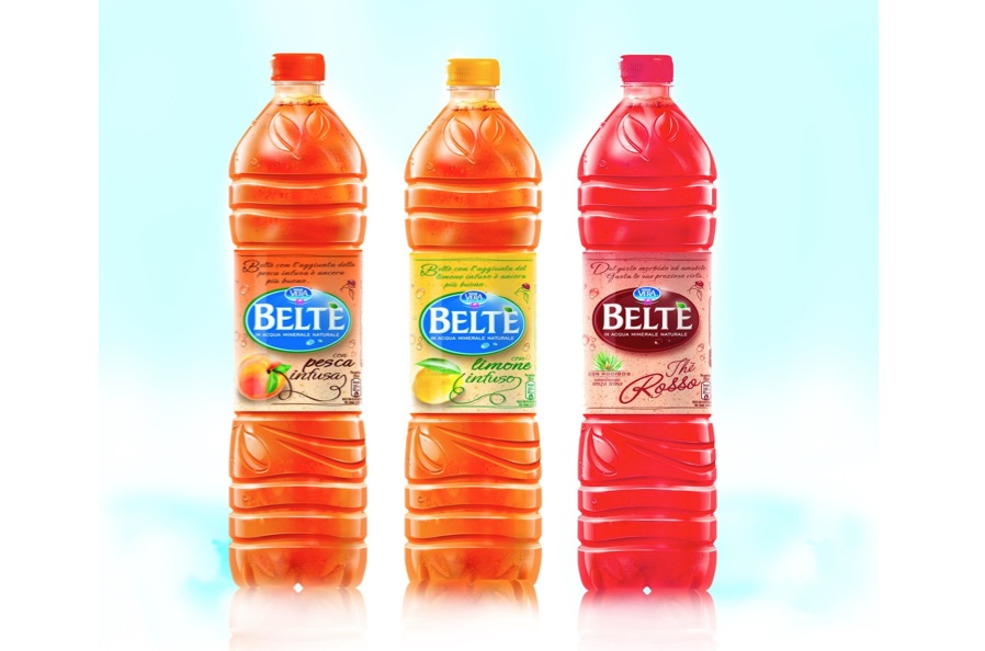
Their product Beltè with Infused Fruit is just that. The infusion is a natural process that allows lemon and peach to free all of their flavors, giving freshness and goodness to iced tea.
So the challenge was, how to get this brand message across in a liter and a half package and how to make it recognizable on the shelves? Take a look–its tall and slender bottle with a square section, completely stands out among the array of short bottles with round sections. The result, also from a visual point of view, puts together marketing goals with aesthetics.
The label transmits a sense of genuineness and goodness and exudes a lightness and fresh feeling. Furthermore the label, simply attached to the wide grip area, allows a constant physical contact between the brand and the consumer.
The stylized tea leaves on the shoulder and on the lower part of the bottle are a key element that gives graphical continuity to the spirit of the brand.
- < Previous Seasonal Soda Packaging From Pepsi NEXT
- Next > Private Label?