American Airlines Unveils New Logo & Brand Design
January 23, 2013 - by ChrisAfter soaring with the same logo since 1968, the nation’s third largest airline, American, has recently unveiled a new logo that will appear on planes by the end of January as well as a refreshed brand design.
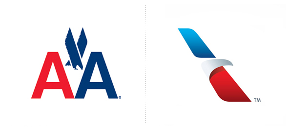
New York based Vignelli Associates created the airy, simplistic design you see here. On the left is the old mark, and the new mark is on the right.

The new logo still consists of the red, white and blue, but are now featured as lighter and brighter—and in a more streamlined form.
American has also decided to update their alternate typography logo. Notice that the new version below has a more refined font in a solid color, a good symbol of unity, considering the words in the old logo were split between red and blue.
Old Logo New Logo

Some elements the brand did keep the same though are American symbols like the eagle and flag — reflecting the airline’s “passion for progress and the soaring spirit.” The new logo also creatively and simplistically introduces some new American motifs that were not in the old mark, such as a star, the letter A, and a runway.
We think the airline will do well with this new logo and re-branding, as it now reflects the times – it’s modern, but still remains recognizable and true to the airline’s core beliefs.
- < Previous Works Design 2012 Holiday Gift - Our Very Own Brand & Packaging Design
- Next > How Americans Really See the Organic Label


