ABSOLUT-ly Artistic
August 22, 2013 - by ChrisRemember when ABSOLUT dominated the vodka world with distinctive bottles, minimalist yet elegant packaging and an advertising campaign that focused on the memorable bottle shape? ABSOLUT’s marketing and design team created not just a player in the spirits industry, but rather a cultural icon that became one of the most recognizable products in the world.
Now, in a small way, ABSOLUT seems to be trying to tap into that cutting edge spirit with a packaging redesign for its flavored vodka line. Today there are dozens of vodka brands on shelf that offer a variety of fruit flavors, and the vodka aisles have become cluttered with a multitude of varieties from companies ranging from national brands to mom and pop distillers. ABSOLUT sought to stand out with a very bold and unconventional packaging design architecture that should distinguish their bottles on the shelf.
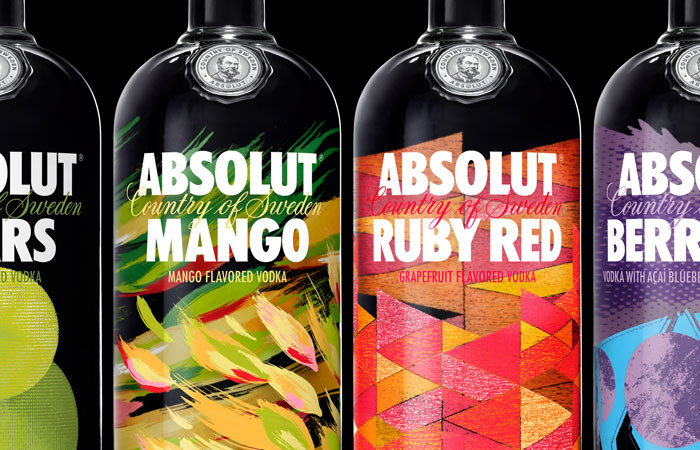
ABSOLUT preserved their brand identity in the logo and typography to remind customers that they are still the renowned, trusted brand that has been a mainstay in this category. At the same time, however, their marketers and designers opted for an abstract and memorable treatment for the fruit varieties with an emphasis on bold colors.
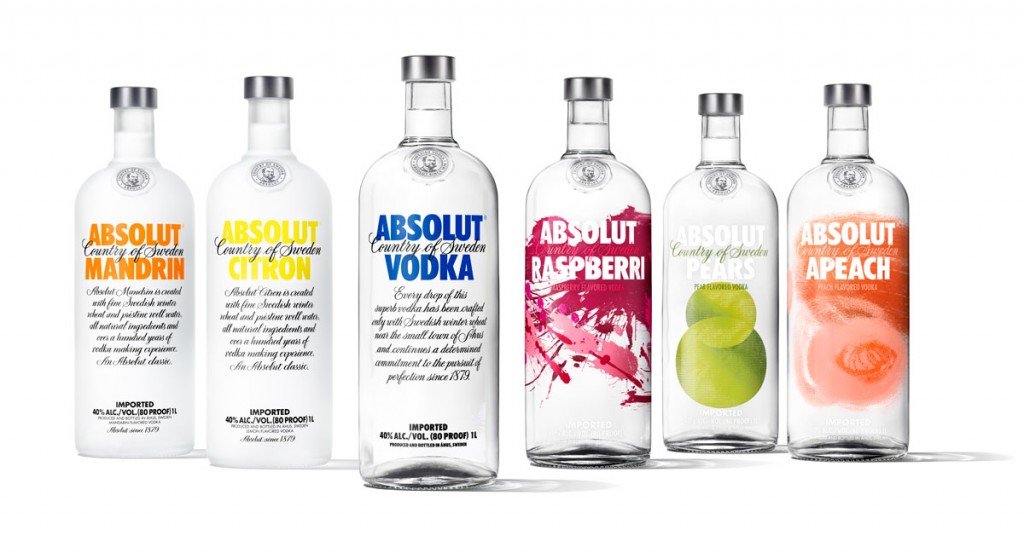
Below are the before and after design styles:
 The company elected not to use traditional fruit illustrations while opting for abstract art in an attempt to convey “the essence of the fruits,” rather than a literal depiction.
According to Anna Kamjou, Global Design Director at ABSOLUT, “this is one of the most dramatic changes we’ve ever made, and our biggest and most transformative design project ever. Our goal was to give our customers distinctive designs that are unlike anything one has ever seen. Vibrant, captivating bottles that bring energy to any occasion and celebrate the fact that every flavour in the Absolut Vodka range is something extraordinary. The standard thinking says a fruit-flavoured vodka requires a picture of the fruit on the bottle. We wanted to break that convention. We asked our design team to reach into the symbolism and myths tied to the ingredients to find each flavour’s core essence – and then amplify that essence through art.”
Source: Design Taxi
- < Previous Gettin' Fancy
- Next > Holiday 2013 Craft Beer Series


