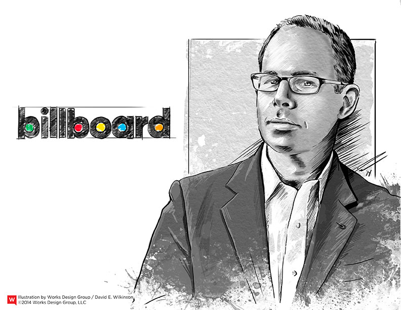
Creative Titans: How Michael Bierut Influenced Typography
February 24, 2014 - by Matt CannonMichael Bierut is one of the most recognized graphic designers in the world. He studied graphic design at the University of Cincinnati’s College of Design, Architecture, Art, and Planning, and is currently a senior critic in graphic design at the Yale School of Art.
In 1980, he began his first job working alongside the legendary Massimo Vignelli and eventually rose to vice president of design at Vignelli Associates. He put in hard work over the years and even worked double shifts for four years at the design firm, and is now a partner in the New York office of Pentagram. Recently, Mr. Bierut redesigned the Billboard logo, among other notable projects. He has won hundreds of design awards and received praise and accolades from innumerable industry professionals over the years.
Popular Work
While at Pentagram, Bierut has created new brand strategies, identities, and packaging for Yale School of Architecture, Saks Fifth Avenue, and Motorola, to name a few.
Bierut set the stage for typographic style design and took advantage of the beauty of fonts and type. He appreciates the way words look and used them to create unique designs that are hard to forget. He likes experimenting with new typefaces until he finds the perfect one for the client. He even hand-drew the typeface for the Nuts.com rebrand. His hand-drawn typeface was digitized and a one-of-a-kind alphabet was created just for the family-owned nut business.
During the Saks Fifth Avenue redesign, Bierut took the iconic cursive logo that was originally drawn in 1973 by Tom Carnese and breathed new life into it. By subdividing the logo into a grid of 64 smaller squares, which were then shuffled and rotated, he was able to create individual logo tiles that can be used to form abstract compositions. This followed Bierut’s strategy to create consistency without sameness.
Design Strategy
His goal is to create designs that people want to look at and read, and that are ideal for everything from logos to corporate brochures. He has given many inspiring talks throughout the years, highlighting his love of the designer/client relationship. Mr. Bierut has said that being interested in the same thing as the client is key to a successful outcome.
He stated that “simplicity, wit, and good typography” are the keys to an iconic design. He further explained that “graphic design is the purposeful combination of words, pictures and other visual elements to support the communication of an explicit or implicit message.” While he doesn’t necessarily follow trends, he does observe them and feels that finding a balance between simplicity and complexity is at the core of the design process.
- < Previous Creative Titans: How Jonathan Ive Shaped Apple
- Next > Creative Titans: Fritz Kahn, the Father of Infographics


