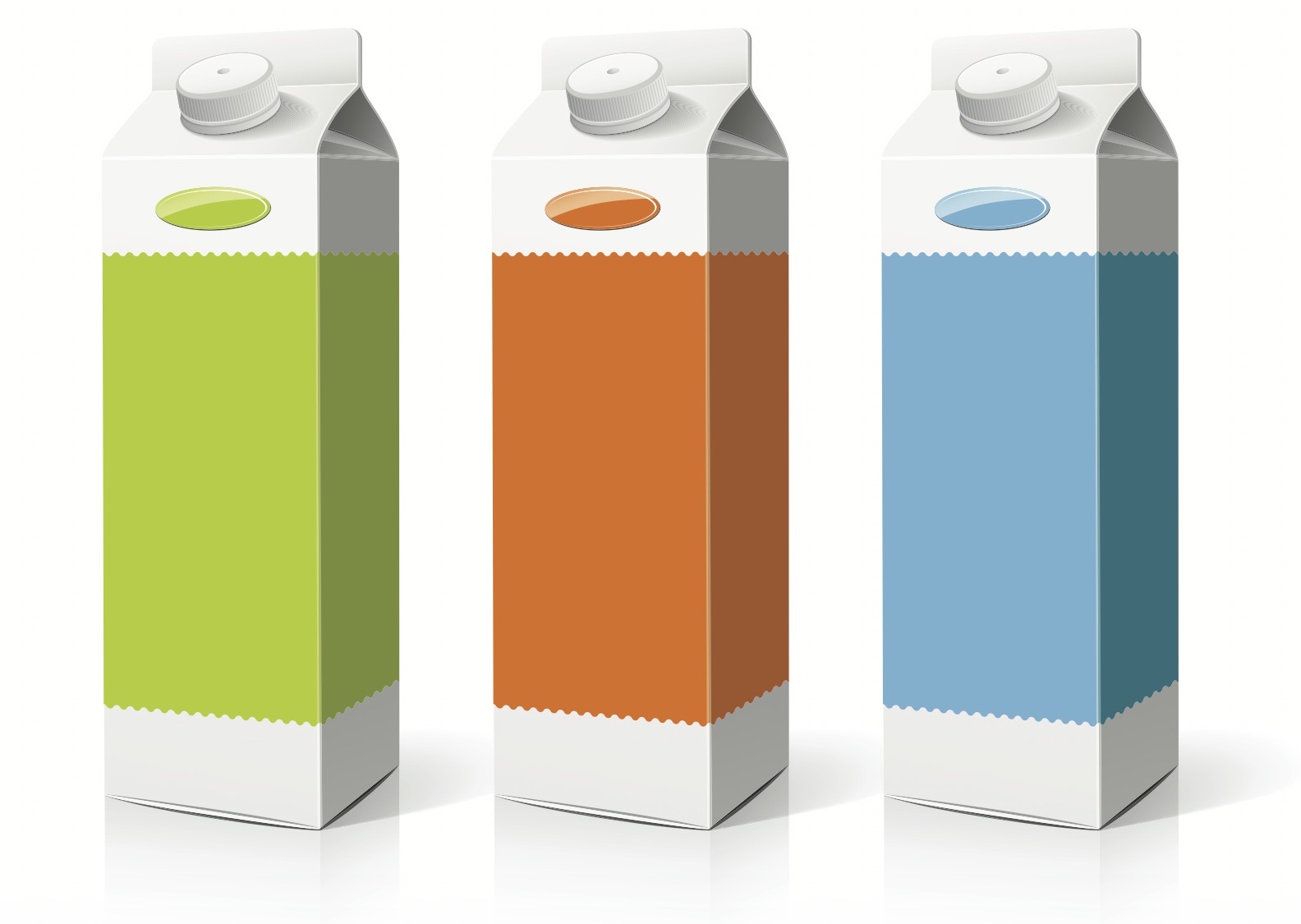
Color Theory & Package Design
March 18, 2014 - by Kory GrushkaWhen it comes to branding and packaging, color is crucial. Colors are often used to trigger sensory reactions and emotions, and to prompt consumers to make assessments about brands.
In an article in the Journal of Management History entitled Impact of Color on Marketing, researchers found that 60-90% of people make snap judgments about products within 90 seconds based on color alone. “Prudent use of colors can contribute not only to differentiating products from competitors, but also to influencing moods and feelings – positively or negatively – and therefore, to attitude towards certain products. Given that our moods and feelings are unstable and that colors play roles in forming attitude, it is important that managers understand the importance of colors in marketing.“
Marketing studies suggest that our habits prefer instantly recognizable brands, which makes color incredibly important when creating a brand identity. Color Research & Application recommends that new brands choose colors that specifically differentiate them from established competitors (Coca-Cola’s can is red, Pepsi’s is blue, 7-Up’s is green… see where this is going?).
All that said, it is important to note that the symbiotic relationship between brands and color can work for you, but it can also work against you. The reason is that there are hardwired connections between colors and the products they represent. Yellow is often used to trigger hunger (Golden Arches, anyone?), possibly due to the fact that starches and breads are often yellow and brown. Blue is subdued and suppresses appetite, and dominant blues and greens are historically unpopular in food packaging design (save in generic household cleaning products and cereals).
Researchers at the University of British Columbia showed fake ads to a group of students, and studied their feedback after seeing different colors. Red produced a positive evaluation of the imaginary product. Blue evoked images of water and tranquility: oceans, openness, peace, calm. They found that blue in product packaging was successful to accomplish specific goals in consumers’ minds—a whitening toothpaste that stops tooth decay –– while red was best to illicit an emotional response and trigger memory.
While certain colors are closely associated with specific traits (e.g., brown with “ruggedness”, black with “sophistication” and “luxury”, red with “passion”), most design and branding professionals agree that it’s far more essential for a brand’s colors to support their personality and messaging rather than reinforcing color association stereotypes. There is a strong correlation between the use of colors and consumers’ perceptions of a brand’s personality. Predicting consumer reaction to a product’s color and custom packaging design is far more important than the color itself. Remember, branding and packaging design can be aspirational… purchasing decisions reflect how the consumer wants their lifestyle to be, not as it actually is.
There are no absolute, concrete parameters or set of guidelines for choosing a brand’s colors and packaging color scheme. Shoot instead to capture subtle feeling, mood, and brand image, because this has the ultimate power of persuasion.
With all that said, here’s an infographic from First Site Guide that speaks to many of these issues, as well as many others!
- < Previous Creative Packaging and the Male Consumer
- Next > Brand Positioning for Men's Grooming Products


