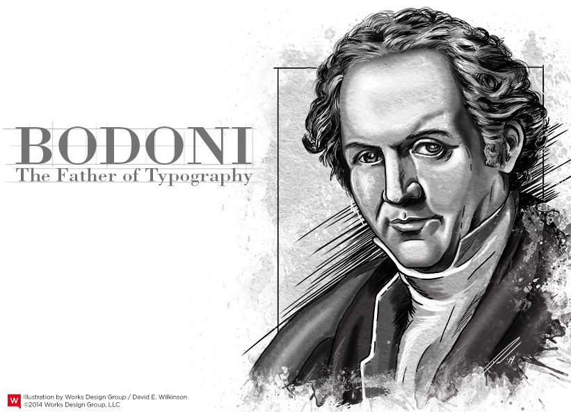
Creative Titans: Giambattista Bodoni, the Father of Typography
December 03, 2014 - by Matt CannonGiambattista Bodoni was a famed Italian typography designer who left his beautiful mark on the world from 1740-1813. His designs of various typefaces were considered more a work of art and layout than actual reading material.
Popular Work
Bodoni designed and personally engraved 298 typefaces over his life, but is most widely known for the typeface Bodoni, which he created in 1790. He was a leader in originating pseudoclassical typography and wrote a number of esteemed books throughout his life. During his time managing various printing houses, he helped produce about 1,200 fine editions. His success eventually allowed him to open a printing press in his own name.
He was born into a printmaking family and followed his father and grandfather into the trade. During his apprenticeship at the Roman Catholic Church’s Propaganda Fide printing house, he was able to master ancient languages and types and was even allowed to place his own name on his first books. During his time teaching the art of printing and typemaking, his prized pupils, The Amoretti Brothers, claimed authorship over the Bodoni type, which led to a famed rivalry.
Together with Firmin Didot, Bodoni created a style of type called “New Face”, which is a style where the letters are cut to produce a contrast between the thick and thin parts of the letter. The text is then offset with wide margins and little to no illustrations.
To this day, Bodoni remains a popular fashion font and is commonly associated with the Armani Exchange, Elizabeth Arden, and Calvin Klein logos. It is also widely used on posters and headlines. What we see today is the result of several modern revivals of the original typeface, but is just as visually striking in today’s modern society. There are also a range of font adaptations, including Bauer Bodoni, FF Bodoni, and ITC Bodoni, which each feature their own unique characteristics.
Design Strategy
Bodoni was an admirer of Pierre Simon Fournier and John Baskerville and was said to have drawn inspiration from them both. He consistently achieved unmatched technical refinement, which allowed him to successfully reproduce the letterforms. The type is extreme, refined, and features a number of unique characteristics, such as a square dot over the letter “i” and a double storey “a”. It reflects true technical skill and refinement, and features hairline serifs without bracketing, vertical stress, and undeniable stroke contrasts.
Bodoni’s strategy simply involved creating pieces out of love and passion. In fact, after his death, a deep scar was detected on his chest, which had been left by the bar of his beloved printing press. The type is a timeless work of art that is so beloved that author G.W. Ovink was once quoted as saying “Bodoni would be an admirable letter for a death notice!”
- < Previous Creative Titans: Walt Disney and the Dream That Began with a Mouse
- Next > Creative Titans: Shigeru Miyamoto and the Story of Nintendo


