Can a Brother Get Some Weird Packaging???
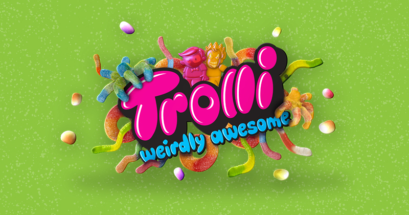
June 24, 2015 - by Kory GrushkaAs you have probably noticed, weirdness is a theme that has been used regularly in product marketing, and for many years. That said, one advertising campaign that we recently came across got us thinking, and as it turns out, writing. Trolli recently launched a new campaign that embraces weird in all its glory, from the taglines (“weirdly awesome”) to the ads to the original and co-created microcontent.

No doubt Trolli (and its ad agency, Periscope) took note of recent ad campaigns in a variety of industries that brought the weirdness. In the confectionary category, Skittles jumped on the weird train a few years ago with a hilariously weird campaign crafted by TBWAChiatDay. Skittles creative has since maintained a reasonable level of weirdness. Similarly, most of you are certainly familiar with the weird ad campaigns that help revive P&G’s Old Spice brand, or the awkwardly weird Southern Comfort campaign that borrows from the awkward films of Wes Andersen (Royal Tenenbaums, et al), Jared Hess (Napoleon Dynamite) and others.
So why does weird work in marketing, and is it here to stay? In our opinion, yes to the latter. And as to the former, weird is a great (and easy) way to stand out in a digital landscape where content marketing is king yet truly engaging content is hard to find. Weird, by definition, is different, edgy, and eccentric. Weird does not require a storyteller to follow a formula or any conventions, as comedic or dramatic storytelling do.
Weird is off the reservation, without any rules, and littered with randomness. And the weirder the better. Given the need to produce a constant stream of original and interesting content in the modern digital world, weird is a relatively easy solution that can be quickly created, iterated, and distributed. And more importantly, we humans just seem to be instinctively drawn to awkward and/or weird things. Maybe its something supernatural, or maybe it has to do with our “morbid curiosity,” as highlighted in this video. One way or another, weird works, its easier than being funny, and its not going anywhere.
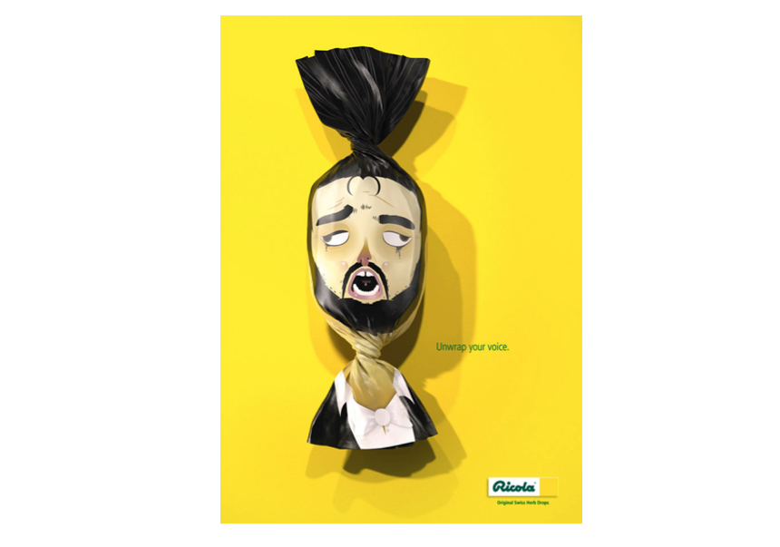
Sooooo… where does that leave us? Well, Works Design is a branding and package design company, so naturally we got to thinking about weird packaging, and weird branding. Funny, but as common as weird advertising is, its just as uncommon to see a large national brand experiment with weird packaging. The ad below from Ricola is an example of weird packaging, but it seems that this oddly innovative package design was just used for print ads in Germany and did not go into production:

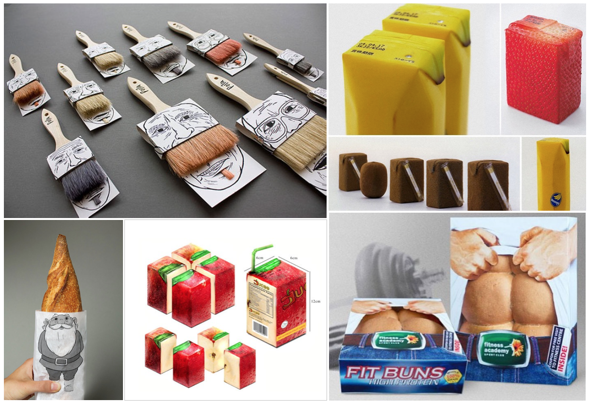
In most cases, weird packaging is left for student work or small (often international) boutique brands that will do anything to stand out on the shelf. Below are a few examples. With that said, does weird not work at the point of purchase, whether on product packaging or on in-store signage? Might there be an opportunity for larger brands to experiment with “weird” innovative package designs to win at the shelf with unique structural packaging or graphics?
Maybe… or maybe not.
But one thing is for sure: when a brand’s messaging and advertising is as eccentric and innovative as Old Spice, it feels a little uneven and disappointing when this is how their products are represented on the shelf. What do you think?
- < Previous Campbell's Taps Works Design for Organic Soup Line
- Next > Busch + NASCAR = Awesome Branding and Packaging


