Creative Titans
Creative Titans: Herb Lubalin, the Father of Conceptual Typography
July 05, 2017 - by Matt Cannon


Born in 1918, Herbert Lubalin was a celebrated American graphic designer and typographer. Commonly referred to as “the father of conceptual typography”, he was responsible for introducing expressive typography into print advertising.
As a colorblind and ambidextrous designer, many of his works are in either one or two colors (usually red and green or red and blue). His own work was fairly reductive, so he had to put his faith in illustrators and photographers to create the full-color images. While some would view colorblindness as a setback, he was able to set his focus on letterform and layout, without being distracted by color. This resulted in some truly unique use of typography that had not been seen before, and would set new trends for emerging designers.
Herb didn’t always have a passion for graphic design. Following his education at New York’s Cooper Union, he worked as an accomplished art director for over 20 years. He wouldn’t begin his storied career as a type designer until 1970.
Popular Work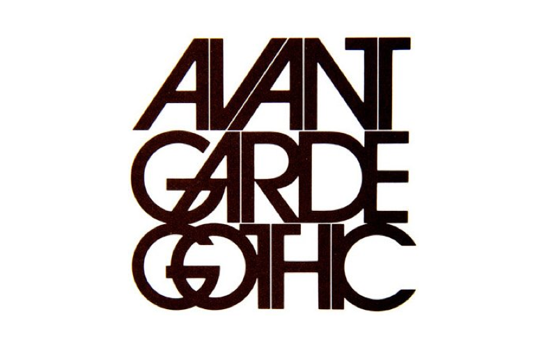
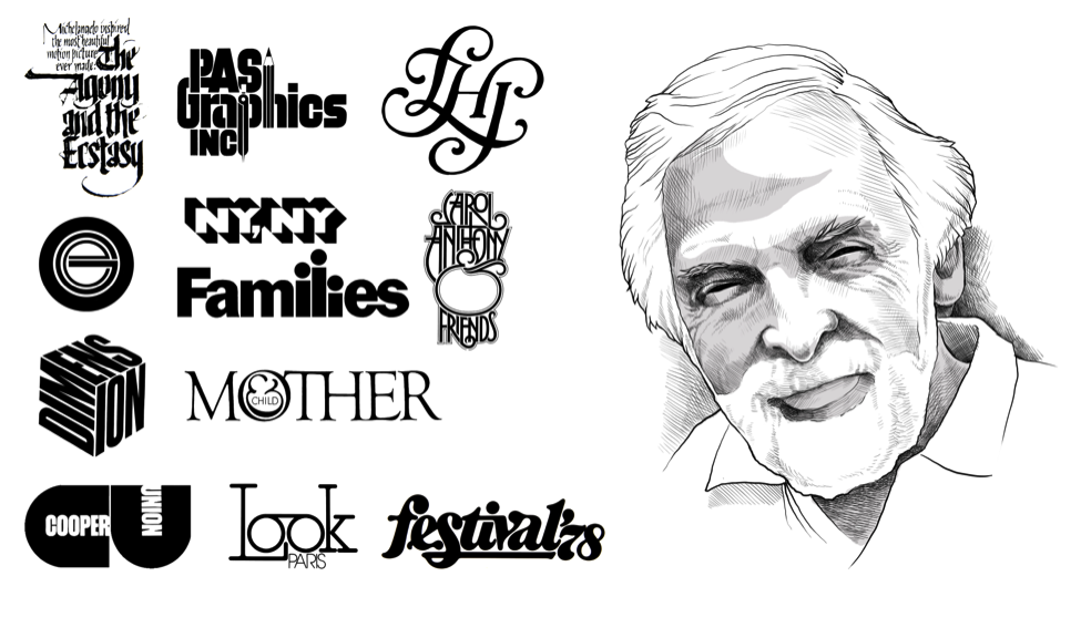
Herb Lubalin has a number of influential typographic works attributed to his name and is responsible for designing the Avant Garde typeface. Along with a number of popular logos, he is also responsible for admired poster designs and avant garde pieces. In 1974, he also created the publication U&lc (Upper and lower case), which showcased the International Typeface Corporation’s (ITC) typefaces (which he also co-founded).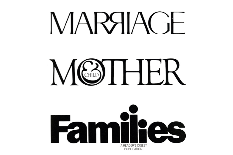 Herb’s philosophy was “you can do a good ad without good typography, but you can’t do a great ad without good typography.” Along with mastering typography in advertising, he also specialized in subliminal logos and the use of negative space. His favorite work (which is also one of his most widely recognized) is a prime example of this. His award-winning logo design for a Curtis Publication, “Mother & Child,” illustrates the name with the suggestion of a fetus inside the logo.
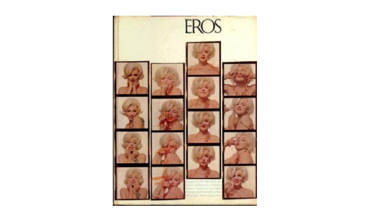 Lubalin was able to express his eclectic side as the art director of three of Ralph Ginzburg’s influential magazines: Eros, Fact, and Avant Garde. There, he was able to combine his work as an art director with his work in typography. The magazines sadly went under due to obscenity charges filed by the US Postal Service against Ginzburg.
Design Strategy
Lubalin didn’t believe that what he did should be considered typography, but rather as “designing with letters”. He was inventive with type and really made words speak, referring to his craft as “expressive typography”.
Lubalin was a political designer who wasn’t afraid to say what he believed. He was a progressive liberal and worked on controversial pieces, like his work with Ginzburg. He didn’t take slack from anyone and was famously quoted as saying: “I’m my own client. Nobody tells me what to do.”
He was the recipient of a number of prestigious awards, including seven Gold Medals from the Art Directors Club, Art Director of the Year Award from the National Society of Art Directors, an AGI and AIGA Medal, a Clio, two honors from The Cooper Union, and the TDC Medal.
Lubalin subscribed to both modern and late-modern ideals, which he worked to seamlessly bridge the gap between. He passed away in 1981, but is still commonly regarded as one of the most influential graphic designers of the 20th century. He helped set the stage for typography in advertising and still serves as an inspiration to modern graphic designers today.
- < Previous Creative Titans: Bradbury Thompson, the Master of Typography
- Next > Creative Titans: Milton Glaser Hearts NY