Creative Titans
Creative Titans: Bradbury Thompson, the Master of Typography
May 01, 2017 - by Matt Cannon


 Born in 1911, J. Bradbury Thompson was a renowned American graphic designer and art director. His impressive background in printing and design began at a young age, when he designed the yearbooks for his high school and college.
Thompson attended Washburn College, where he later designed the college’s mascot and the Washburn College Bible, which was the most significant development in Bible typography since it was first published by Gutenberg in 1455. During his notable career, he received the American Institute of Graphic Arts Gold Medal in 1975 and the Type Director’s Club Medal in 1986. He was also a member of the Art Directors Club Hall of Fame.
Popular Work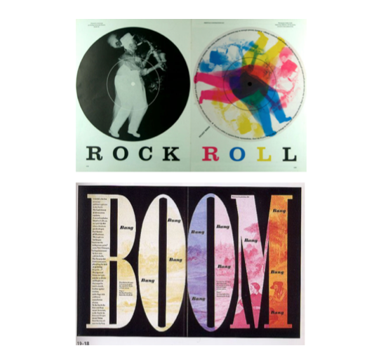
As Thompson put it: “type can be a tool, a toy, and a teacher”. He perfectly illustrated this with his design of the monoalphabet, Alphabet 26, in 1958. The simplified alphabet system contains only 26 unique characters, with the case established by letter size only. Alphabet 26 consists of a transitional serif that mixes lowercase with uppercase in order to make the letters more logical and intuitive.
As the designer of more than 60 issues of Westvaco Inspirations, he was credited with combining photography, typography, and color to create one cohesive design. He also designed or redesigned more than 35 respected magazines, including Business Week, Harvard Business Review, and the Smithsonian magazine.
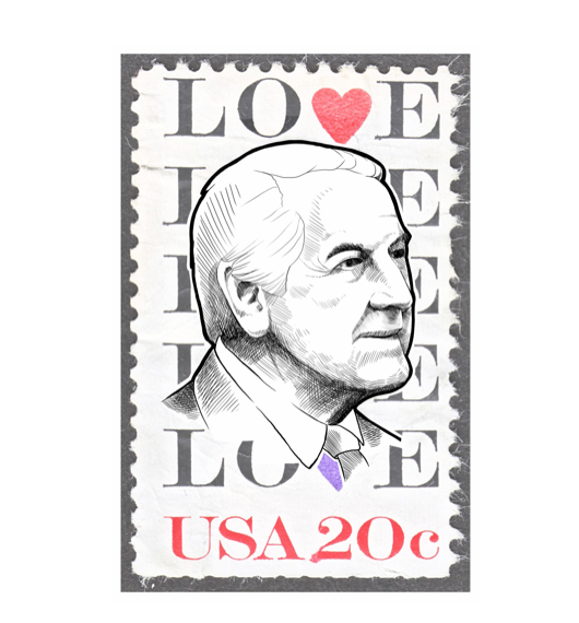
During his 15 years as art director of Mademoiselle Magazine, he hired many up-and-coming artists to illustrate the magazine’s strong fiction section, including Andy Warhol, Joan Miro, Willem de Kooning, and Jasper Johns. He also served on Yale University’s faculty to further inspire emerging designers.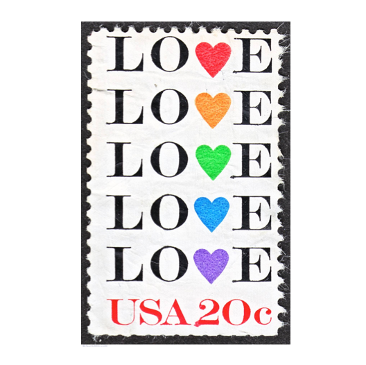 Some of Thompson’s most popular work consists of his extensive contemporary postage stamp designs. Serving on the Citizens Stamp Advisory Committee from 1969 to 1978, he created more than 90 stamps of his own and consulted with the U.S. Postal Service in guiding the design of future stamps.
Design Strategy
Thompson believed in simplifying things. He didn’t believe that a letter (or any graphic symbol) should have two different designs. This led to the creation of his 26-letter font system, which is easier to read, write, and memorize than the existing alphabet of over 40 different characters.
Commonly referred to as the “Master of Typography”, he was best known for his bold use of type. He paid homage to traditional design and modernism in his work by blending modernist typography with classic typefaces and historic illustrations.
The New York Times Book Review said that his artistic autobiography, “The Art of Graphic Design,” was a book in which “art and design are gloriously and daringly mixed”, which is a good representation of his design strategy in general. While Thompson passed away in 1995, his legacy remains strong in the design community through his teachings and iconic book, magazine, and postage stamp designs.
- < Previous Creative Titans: John Maeda and the Art of Simplicity
- Next > Creative Titans: Herb Lubalin, the Father of Conceptual Typography