Branding
Brand Positioning for Men’s Grooming Products
March 31, 2014 - by Kory Grushka


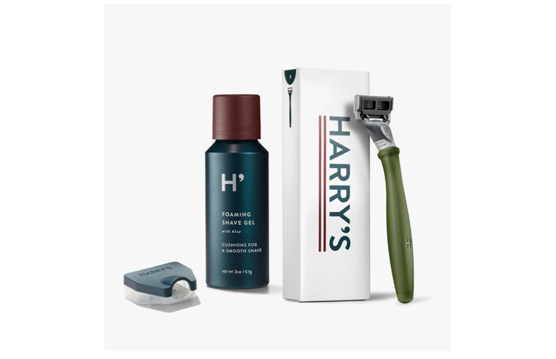
 The personal grooming market is experiencing healthy growth boosted by innovative packaging and viral marketing campaigns, and a large number of competitors that are very skilled in brand positioning. To that end, male consumers are becoming increasingly comfortable with the idea of using grooming products, according to Kline’s 2012 research report.
 Nickel, a French line of men’s grooming products with a namesake spa in Paris, uses the same strategy… heavy-duty flask-style bottles, large tubes and metal canisters. Among Nickel’s most-popular products is its Super Clean body scrub shaped like an industrial gas canister, meant to invoke an all-American man’s love affair with cars and elbow-grease mythology. Nickel’s gift sets resemble cocktail shakers, and boxes are decorated with kitschy graphic-novel illustrations. The ultimate effect is a classic American masculinity, and will attract customers who seek to project that through their purchase decisions.
Standing out on the shelves is always a key consideration for packaging design, and particularly so in this competitive product category. When Nivea first introduced its Extreme Comfort line for men (shaving gel, post-shave balm, body washes, revitalizing body lotion), the brand chose its legacy blue and silver color scheme (which happen to be masculine colors), and created a package design architecture that created a “pop” in the aisle. This was paired with a more bold, flat version of the Nivea logo. The products were a huge boost in revitalizing and re-positioning the Nivea brand for an entrenched male demographic, while at the same time retaining much of the equity held by the existing Nivea brand.
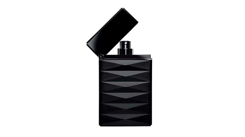
For high-end masculine positioning, many brands aspire to attract the sophisticated, urbane man who already feels comfortable buying grooming products. Black packaging, silver accents, and classic serifed typography create a sleek, timeless, ultra-luxe look. Tried-and-true color palettes of aluminum, gold, and dark blues instantly signify “masculinity” and “luxury.” As always, if the products are marketed as best-in-class, the packaging must reflect that.
- < Previous Color Theory & Package Design
- Next > Brand Stories: PBR and the $44 Beer Bottle