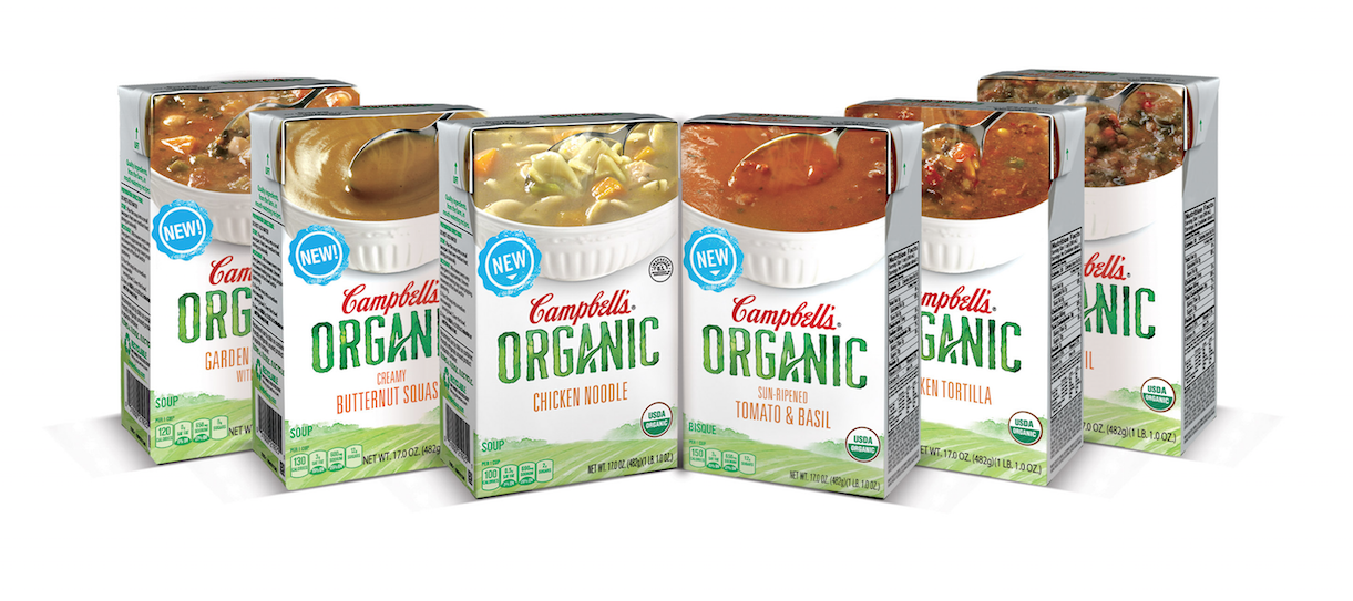
Campbell’s Taps Works Design for Organic Soup Line
May 04, 2015 - by Kory GrushkaWe are proud to announce that Package Design Magazine featured one of our recent branding and package design projects in their April 2015 issue – Campbell’s Organic Soups. 
The article in Package Design Magazine (find it here) details the process that we went through to help introduce Campbell’s into the organic soup aisle. From typography choices to design hierarchy to the significance of the USDA organic seal, the article shines a light on the design process to take an organic product to market. Below is an excerpt from the article:
After making the decision to go organic, Campbell’s wanted to move quickly to debut the product line. So, it decided to partner with a former employee’s design firm, Works Design Group. The agency’s principal, Bill Hutches, worked inside Campbell’s two decades ago. Having less time to let the creative juices flow posed a branding challenge for the Works Design Group and Campbell’s team, whose main player inside was Lenny Sulewski, senior design manager at the $8.3 billion soup and food conglomerate.
“We had the first phase done within two weeks, including research,” Works Design Group art director Chris Burton says, noting that Phase 1 work usually takes between four and six weeks. Competitive intelligence revealed that very few brands were bringing organic to the forefront. Even if Campbell’s organics were to stand alone, the company name and logo would still need to be prominent, the team ultimately agreed.
- < Previous 10 Package Design Trends for 2015
- Next > Can a Brother Get Some Weird Packaging???


