
Packaging
Why Your Club Store Packaging Needs a Portfolio Strategy
July 07, 2014 - by Kory Grushka


In the club store world, package design is arguably more important than in any other retail channel. Club stores are unique in that they feature very few products, wide aisles, uneven lighting and products that are merchandized on large pallet displays. Given these variables, bold yet strategic packaging is absolutely essential to success in club stores. Moreover, any large brand that sells multiple products or varieties into club stores should have a cohesive design strategy for its portfolio.
To that end, successful club store packaging draws a consumer’s attention and very quickly communicates all the key takeaways. When multiple products or varieties are offered, consumers need to be educated as to the contents of each product package, the relationships between the products and their relationships to the brand(s). A recent project that we completed for Campbell Soup Company demonstrates how club store packaging can be optimized across a portfolio of products.
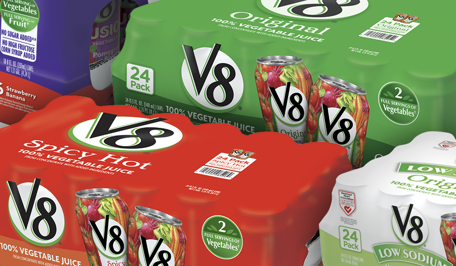
Campbell Soup Company recently turned to us for a redesign of their club store packaging system for all V8 branded beverages. Prior to our redesign, V8’s club store packaging featured multiple design schemes that did not effectively draw the consumer’s attention or communicate the key takeaways. Additionally, the existing packaging system featured a variety of colors and patterns, with no coherent structure to delineate between products or varieties.
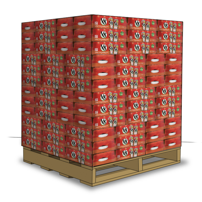
To kick off the project, we visited numerous club stores in multiple regions around the country, and conducted research around the club store channel, competitive landscape and packaging trends, among other things. In order to quickly draw the consumers’ attention, we collaborated with the client to create a packaging system around color blocking.

Color blocking is one of the most effective techniques for club store packaging design, and involves bold solid color and simple, uncluttered layouts. At its core, this technique visually creates a solid block of color when multiple packages are stacked on a pallet.
To support the color blocking, we conducted extensive color studies and built a visual architecture with bold and distinct colors to identify varieties in the portfolio, and a simple layout featuring photorealistic 3D product renderings.
While these design techniques clearly will not fit every product portfolio, the takeaway here is that large brands should not be introducing one-off club store packaging designs. Rather, they should be thinking in terms of their overall portfolio, while building a cohesive design strategy that quickly attracts, communicates with and educates the consumer.
- < Previous Brand Stories: The Evolution of Applebee’s
- Next > Our Latest Work for Campbell's