Colors that Yell
February 24, 2017 - by Taylor GetlerWith the trend of minimalist, stark packaging still going so strong, some brands are pushing back with designs that scream from the shelf. Hot pink, blood orange, teal – all are showing up in product categories that have never gone so bold. We know that color choices evoke different emotional responses for consumers, and playing with combinations can help shoppers connect with brands. Clashing colors are also usually more memorable and therefore are great for brand recall, especially when the colors are unique to the product.
Using loud, expressive colors is a way for brands to differentiate a special edition product, allowing them to break out of their standard molds and appeal to new groups. This can be highly effective for brands looking to target younger consumers, who are appreciative of companies that are willing to take on a little edginess and aesthetic risk. Large brands looking to emulate the look and feel of small brands should take note of how the following companies have successfully crafted exciting packages by taking chances with color.
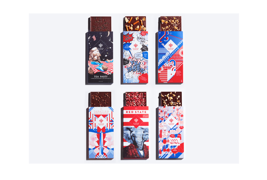
Harper Macaw
Last spring, D.C. chocolatier Harper Macaw released a series of bars inspired by the election. Naturally, the wrappers use bold reds and blues, and the result is gorgeous and striking. Rather than feeling like political cartoons, the chocolates are elegant and find the beauty within the absurdity of our current political climate. For a time that has been so stressful and dividing, at least we got a little something sweet out of it.
Bud Light
Bud Light is now the official beer sponsor of South by Southwest, and the funky, psychedelic cans that they issued in limited release last year were such a hit that they are coming back for the 2017 festival. With bright blues, orange, yellow, red, purple, green, and a shock of black, the packaging perfectly captures the vibe of the festival and of the famously “weird” city of Austin.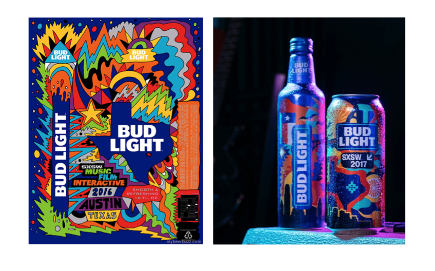
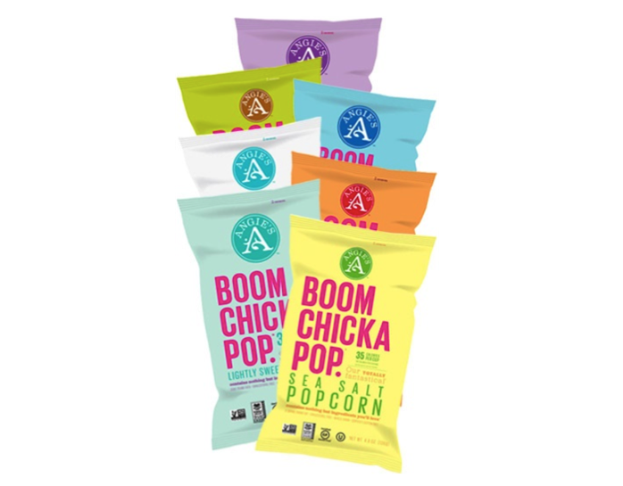
Angie’s BOOMCHICKAPOP
Angie’s BOOMCHICKAPOP sticks out like a sore thumb among competitors, with a heavy fuchsia font that pops (pun intended) against solid feminine backgrounds. This is a great example of how color clashing can be used in a way that is playful without being childish – this design communicates maturity while remaining effectively eye-catching. The color choices here indicate that the snack is something indulgent and luxurious, a cut above all of the Orville Redenbachers and the Act IIs.
Wild Leaf
Most tea brands try to communicate the same themes: tranquility, peace, smoothness, etc. Wild Leaf has decided to take an entirely different approach, with wild colors that would be striking on their own and are even stronger when put together. Energetic and youthful, with a large callout for its specific properties, it’s certainly more fun than your grandma’s Lipton.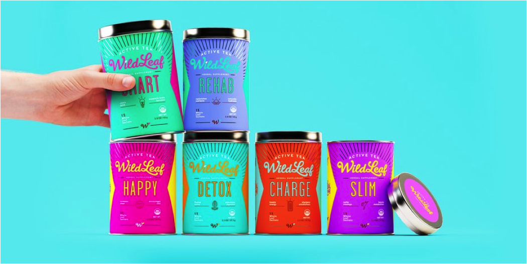
Ciao Bella
The bright, beautiful color palette that Ciao Bella used for their line of gelatos is a great example of risk paying off. Brands of ice cream and similar treats often struggle with how to clearly target adults, and the rainbow of color could have easily made it seem like it was a dessert for children. Instead, the careful color pairings elevate the packaging to a new level of sophistication, while still looking just as visually interesting and trendy as competitors like Ben & Jerry’s.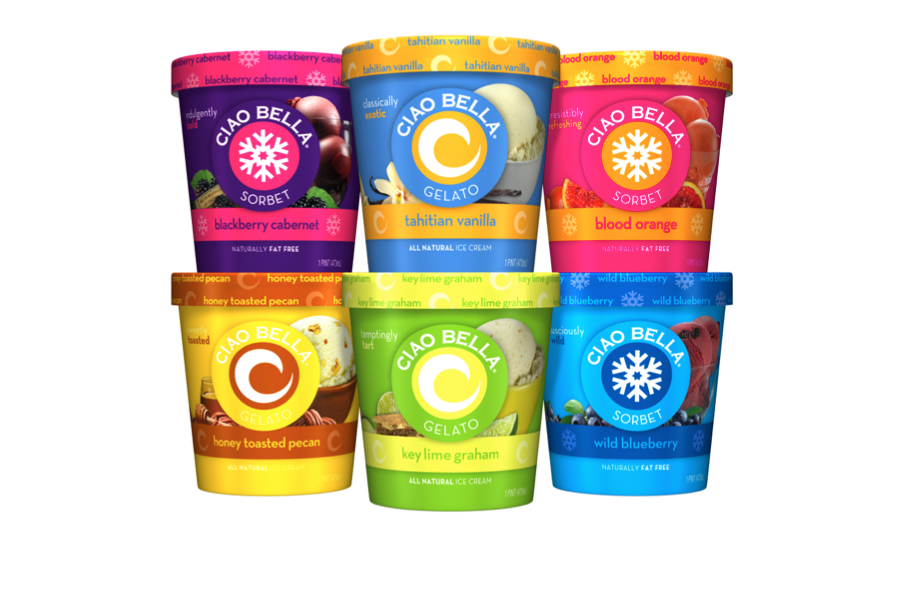
- < Previous Unexpectedly Iconic Designs
- Next > Pop Culture Packaging: The Impact of TV and Movies on Design


