Branding
Friendship Before & After
September 06, 2012 - by Kory Grushka


Nope, not the relationships–the brand!
There is a lot to say about this re-design from Friendship Dairies–initial reaction–awesome! They have put a modern twist on their existing logo AND successfully combined their logo and each SKU description. With a simple twist and pops of color, Friendship Dairies without a doubt will stand out amongst their competition. Here is a look at the old lineup: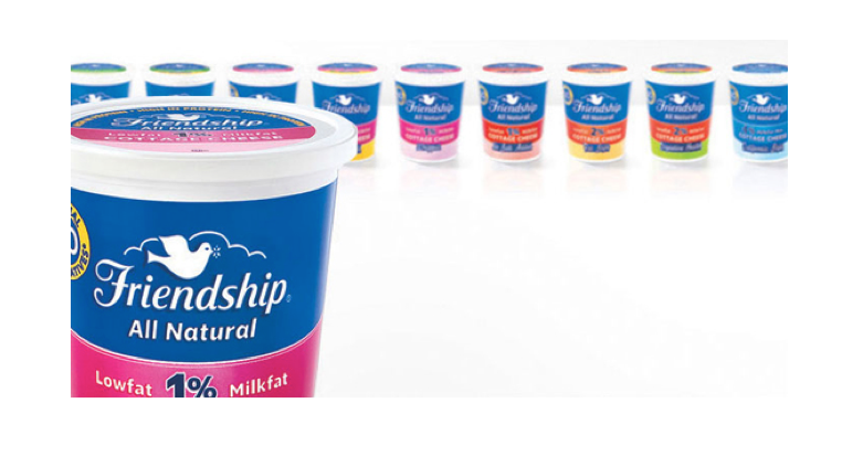 From a predominately blue background before to such drastic color improvements here, Friendship Dairies has made it easier for consumers to find what they are really looking for: milk fat percentage. Sure there was some color differentiation before–but not to this magnitude. Without making too much of a change, they were sure to keep their signature dove emblem that their consumers recognize. Take a look:
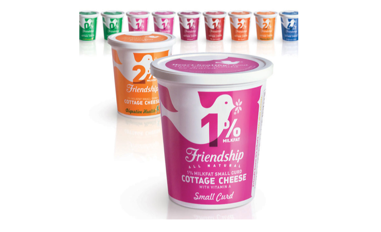 These colors have allowed shoppers to find their favorite SKU quickly which is key to today’s buying experience. While making it easier for consumers, Friendship added some sass to the fridge!
What else? Even the lids feature the new variety color and a little quote. The world of food packaging design is a competitive environment, with many heritage brands having an aversion to any change. This is an outstanding example of the opposite – that is, a brand willing to revitalize its identity while changing with the times in a functional, rational and engaging way.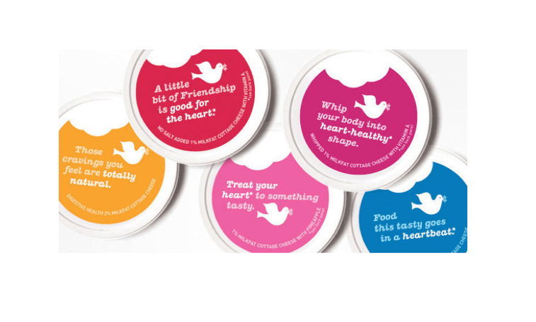
- < Previous Unveiling the First New Logo from Microsoft in 25 years!
- Next > Honey's Angels