Unexpectedly Iconic Designs
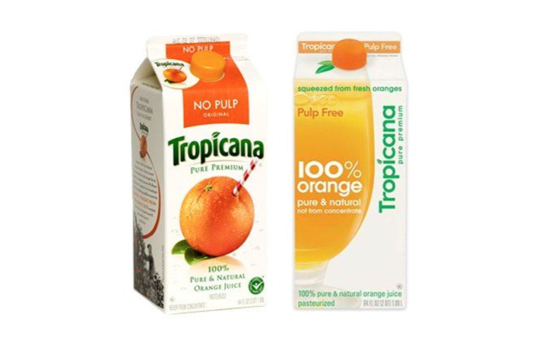
February 17, 2017 - by Taylor GetlerSometimes brands just don’t understand the power of their own designs. Bad design can result in catastrophic failure for even the most successful and well-established companies, as seen with Tropicana’s disastrous attempt at a redesign in 2009. The packaging was so reviled that it caused sales to plummet by 20% over a two-month period, costing the juice company $30 million in lost transactions and a huge undisclosed sum in costs associated with reverting back to the old design. On the other hand, good design has the power to multiply profits several times over – as was the case with Botanical Bakery, whose 2010 redesign tripled sales in a single year. This is the dream of most brands, and, usually, companies will invest heavy amounts of time and money to make sure that such a project is strategically sound. In a few cases, however, brands have taken risks by choosing designs that they did not feel especially strongly about, only to see huge rewards for their gamble. Below are three examples of designs with low expectations that went on to become iconic, generating untold profits and consumer loyalty for the brands attached to them.
The “Jazz” Solo Cup
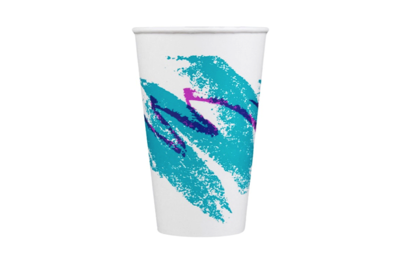
In 1991, the Sweetheart Cup Company selected a design by employee Gina Ekiss in an internal contest to be featured on cups and plates. Gina received no bonus, awards, or recognition for her contribution, which was called “jazz”. The design – featuring a teal blue zig-zag under a thin purple zig-zag – went on to become the company’s all-time bestseller, and is now a pattern considered to be emblematic of the nineties. Gina’s identity (and status as an unsung hero) was only discovered in 2015 after someone on Reddit with the username “mcglaven” started a thread dedicated to tracking down the designer. Today, the design has a cult following that has inspired everything from apparel lines to social media pages.
La Croix’s Groovy Look
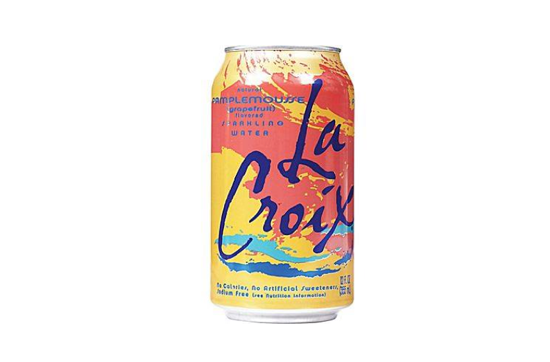
When National Beverage sought to differentiate their seltzer drink La Croix from competitors, they hired Alchemy Brand Group to redesign the can. Of all of the options presented, National Beverage liked the current “Picasso-esque” design the least. However, it tested so incredibly well with consumers that they decided to take a chance with it, and the distinctive design is credited in part with La Croix’s massive success today.
The Anthora Cup
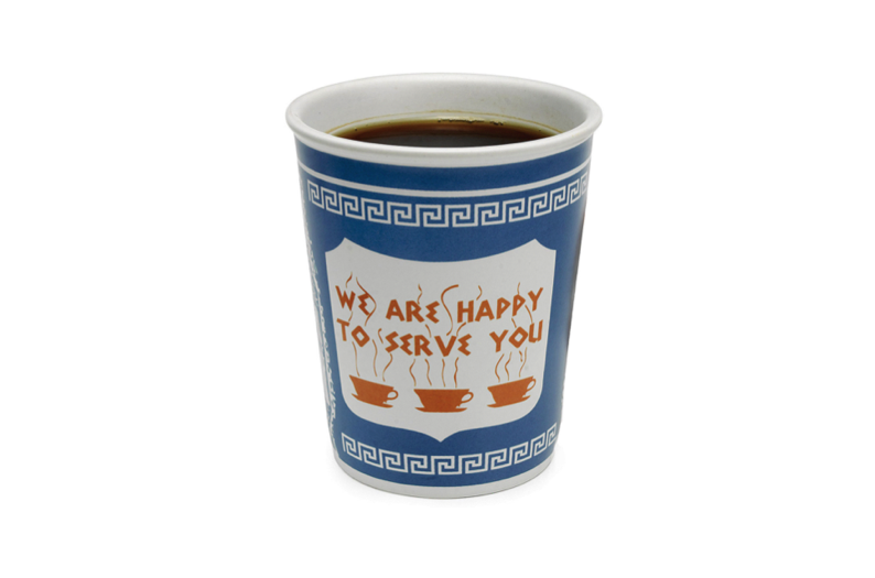
Leslie Buck – born Laszlo Bück — immigrated to America after World War II, after having survived both Auschwitz and Buchenwald. After starting a paper cup manufacturing company with his brother (who was also a Holocaust survivor), he moved to a startup called Sherri Cup in the 1960s. It was there that he designed a hot cup in the colors of the Greek flag, aimed at the predominantly Greek diner owners of New York City. Buck did not receive any royalties from his design, but the company sold hundreds of millions of what is now considered to be an extremely recognizable piece of New York iconography.
- < Previous Valentine's Day Candy Packaging
- Next > Colors that Yell


