10 Package Design Mistakes and Why You Should Avoid Them
July 31, 2017 - by Matt CannonEvery designer has encountered some major package design mistakes in their career, so we’ve covered some of the most common (and unfortunate) ones below. Avoiding these common blunders can save your business time, money, and embarrassment later.
Test your packaging with your target consumer groups to ensure it is easy to open, eye-catching, and hits all the right marks. If your packaging doesn’t attract your target market or help your business reach its goals, it may be time for a rebrand.
1. Overcomplicating Things

Simplicity is key to straightforward, streamlined designs. Making the design overly complicated will just confuse customers. You’ll want to leave enough pertinent information to answer your customers’ questions about your product, without overcomplicating or confusing things.
Kraft transformed their clean, long-standing iconic logo into a juvenile, flamboyant logo with nine opposing colors. This resulted in a more expensive, complicated design that just left customers confused. They eventually saw the error of their ways and redesigned the logo and branding to something that better aligned with consumer expectations.
2. Excess Packaging

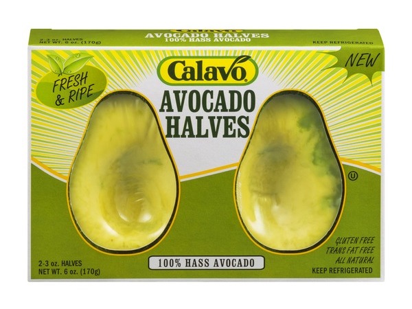
Excessive packaging is bad for everyone. Consumers respond negatively to waste, stores don’t like giving up so much shelf space, and the company is losing money on unnecessary packaging.
3. Typos and Misspellings

This may seem like a fairly obvious mistake, but it’s more common (and costly) than you may think. Nothing breaks down your business’s reputation like a simple misspelling.
4. Blurry Images

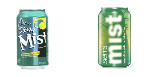
Sierra Mist’s rebrand efforts included a blur effect that just ended up making everything difficult to look at, which was a bigger problem than they may have realized. Based on a 2016 study by The Benchmarking Co. on beauty product packaging and beauty consumers, 83% of consumers said that the name of the product needs to be easy to read.
5. Bad Placement

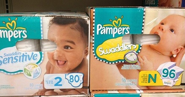
Sometimes, the placement of seemingly insignificant things can really throw off the whole design. As is the case with Pampers’ pull-off handles, bad placement can look humorous, phallic, or juvenile, which reflects poorly on the brand.
6. Forgetting Your Loyal Buyers

Consistency is key to creating a strong brand image and brand loyalty. If your packaging isn’t consistent, it won’t match your overall vision and can leave customers confused.
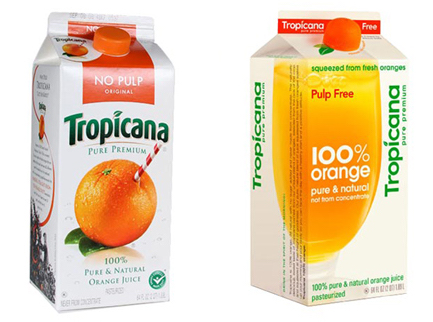
As in the case of Tropicana, sometimes, big name brands veer too far off the norm and end up turning their backs on their loyal customers. Tropicana was attempting to make more “down to earth” packaging, but ended up with a design that looked more suited to a generic store brand. This left customers puzzled, and sales plummeted as a result.
7. Difficult to Open

If a package is too difficult to open, consumers may choose a competitor’s product next time. In fact, this issue is so frustrating that it’s been given its own name: “wrap rage”.
8. Outdated Design

There is a difference between vintage and just plain old. If your packaging is outdated, it can make your company seem old and insignificant as well. It’s important to keep up with the times so that your brand can continue to stand up to the competition.
9. No Unique Traits

With an oversaturated market, it’s important that your product can stand apart from the rest. If your branding looks too similar to the competition’s, you’re missing an opportunity to reach customers from the shelf. While your branding should stay in line with your competitors, it’s important to find the unique traits that help you stand above the rest.
10. No White Space

Leaving white space is a great way to highlight the most important characteristics of your product. It also keeps things simple and straightforward, so it’s important to leave plenty of it.
- < Previous 5 Designs We Love: Sustainable Packaging Designs
- Next > 25 Package Design Trends for 2018


