Pier 1 Imports
Background
1 design system for 10K+ private label SKUs.
Pier 1 Imports engaged us to develop a new package design system for all of their standard private label products. The existing packaging featured prominent use of a muted, beige color. The challenge was to create an iconic yet standard design that stood out on shelf in the colorful and vibrant Pier 1 environment, while also being flexible enough to work across 10K+ SKUs (and potentially hundreds of packaging structures).


Research
Dozens of competitor store visits and deep pattern exploration.
As part of our design process, we visited dozens of Pottery Barn, Crate & Barrel and other competitor stores. What we found was that their competitors’ private label packaging looked fairly similar to Pier 1’s… beige or great, with a minimalist and recessive design. To that end, we aligned on the idea that a distinctive and scalable pattern should be key to this redesign, and we did extensive exploration into potential patterns from around the world.


Design
6 distinctive design concepts; 6 vastly different perspectives.
When we deliver initial design concepts, we take pride in ensuring that each different concept brings its own personality, while challenging our clients to consider new and unique perspectives with each new concept. That was precisely what we did with this project, and Pier 1 ultimately settled on a bold blue flood of color and wave line pattern.

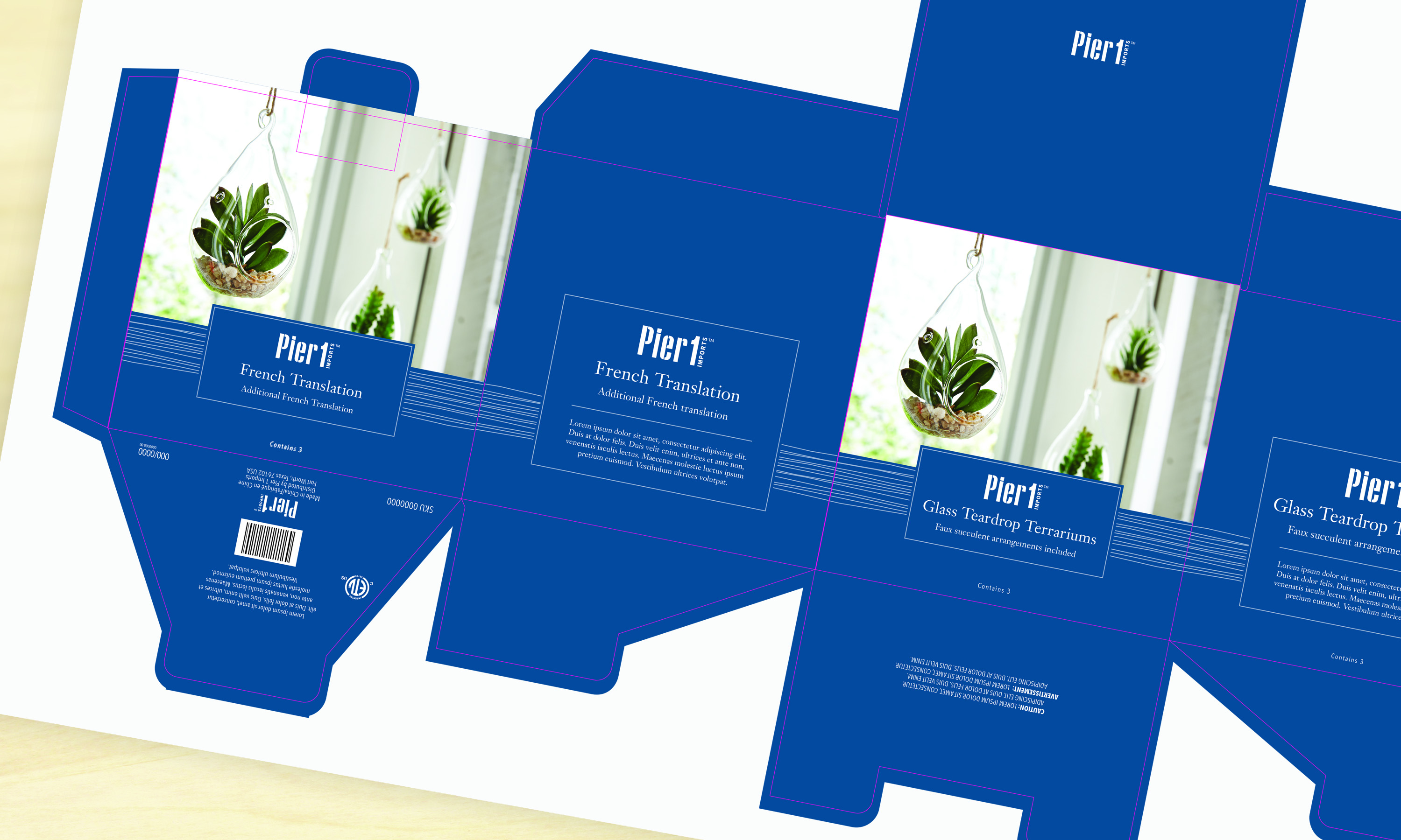
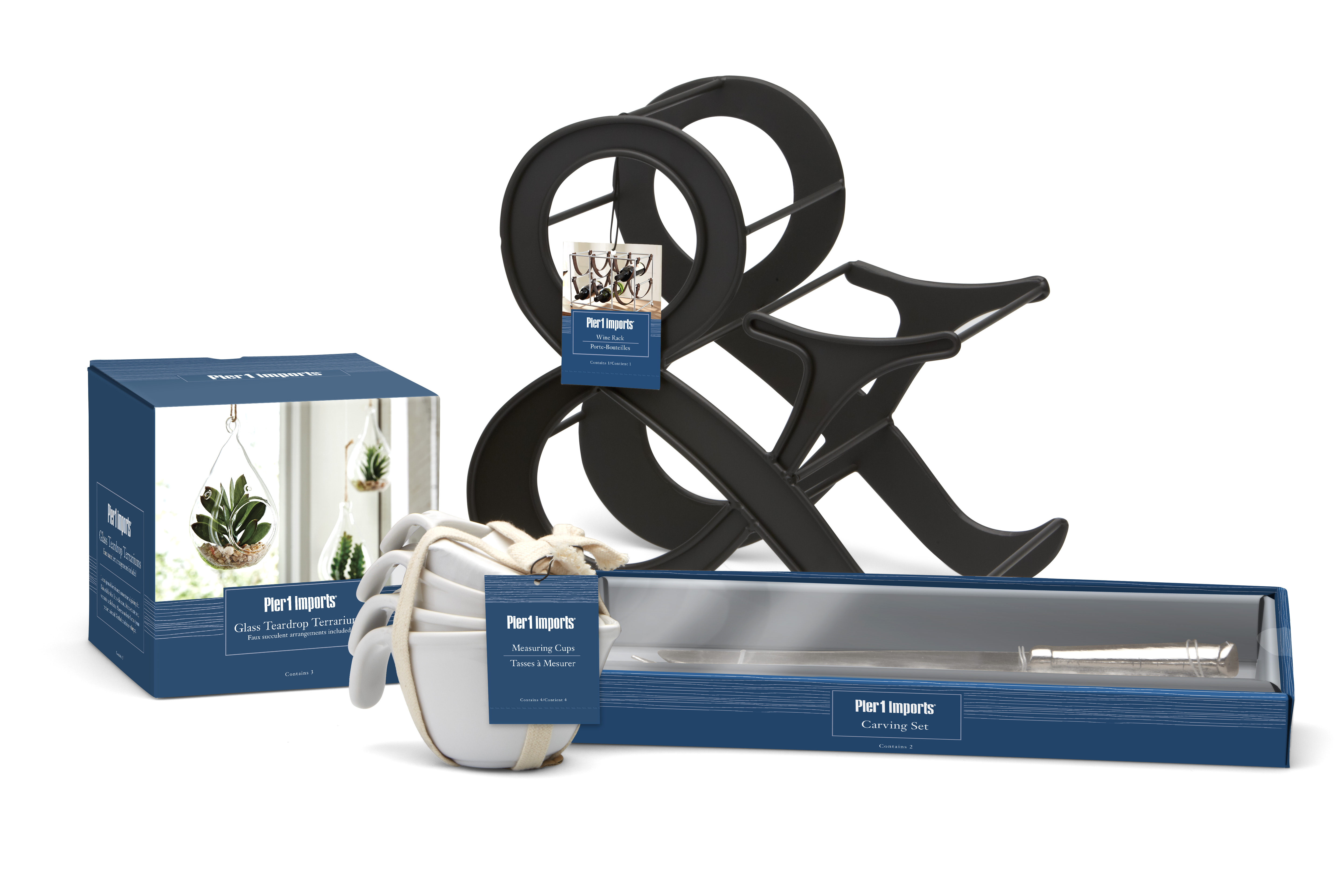
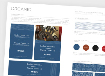
The Deliverables
A new and dynamic system that was equal part flexible and rigid.
The project scope involved us designing 5 unique package designs, each with a representative structure. Moreover, we delivered comprehensive packaging guidelines that would serve as a bible for the in-house team of multiple production artists. The final results can be seen below, and the packaging can be found in Pier 1 stores today.


