Original Packaging that was Better than the Redesign
March 13, 2017 - by Taylor GetlerPackage redesigns are famously tricky. On the one hand, updating a product’s look can be an important part of appealing to new consumers and staying fresh in an evolving market. On the other hand, companies risk losing valuable brand equity when they sacrifice recognizable design. When faced with the challenge of a redesign, sometimes brands just don’t get it quite right, and would have been better off sticking with their original look. Here are three recent examples of redesigns that did not deliver the effect that companies intended.
Miracle Whip
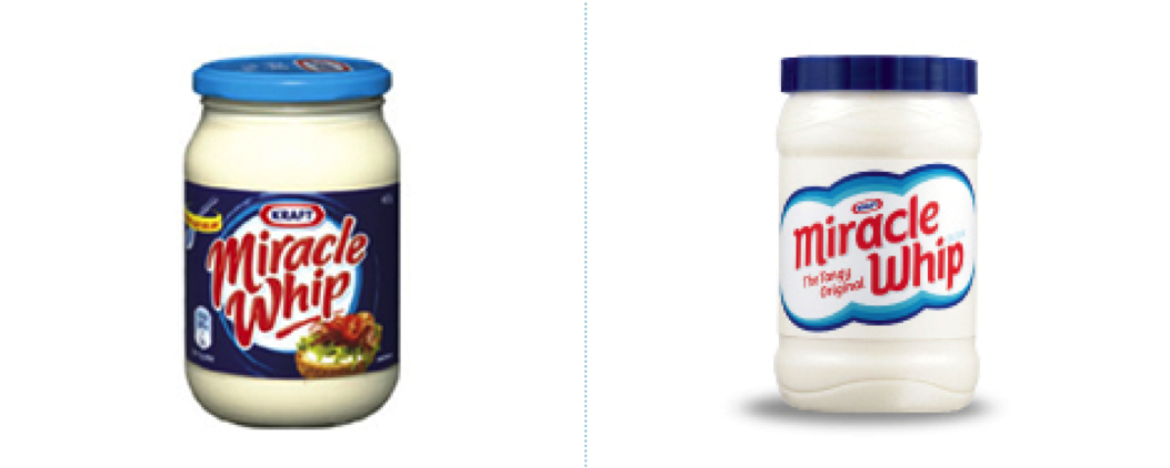
In Kraft’s defense, Miracle Whip was due for a modern upgrade. The redesign that they chose in 2009, however, was uninspiring and bland. It’s clear that they were trying to go more minimalist, but the result made the product look unappetizing and generic, with no indicators of flavor other than the words “The Tangy Original”. Kraft quickly realized the error of their ways, and in 2010 a new design was released that retained more of the fun and color of the original packaging.
Weight Watchers
In 2012, Weight Watcher’s had their logo redesigned by Pentagram. Keeping with the trends of the time, they opted for a gradient and a heavy font, with no space between the words. The company, which sells products related to dieting ranging from books to packaged foods, wanted their new look to highlight the transformation that consumers experience through the brand. What they were not counting on, however, was that a vulgar British slang word was now smack dab in the middle of the logo, which consumers in the U.K. found very difficult to look past.
The Happy Meal
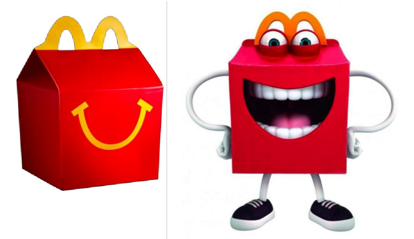
Few things are as iconic to the children of America as the Happy Meal box. The simple, sweet design had a lot of personality, and it represented years of brand loyalty that McDonald’s had built with families. In 2014, the company decided to reintroduce mascots into their branding, including a new one in the form of “Happy”, whose realistic smile and crazy eyes terrified consumers. The new boxes quickly became the subject of public ridicule and scorn, inspiring everything from memes to thinkpieces about how McDonald’s had evidently lost their minds.
An important thing to keep in mind here is that all three of these companies – Kraft, Weight Watchers, and McDonald’s – are multimillion-dollar corporations with huge marketing teams and expensive consumer research, yet even they have gotten redesigns very, very wrong. It’s difficult work, and both the design community and the food and beverage industry are still figuring out the best ways of going about it. But for every failure, we all learn a little more about how to do better next time, which is especially true for companies that are as large as these three. If the public disaster of the new Happy Meal box prevented us from having to deal with more disturbing mascots that may have been in the works, then it was worth it.
- < Previous Pop Culture Packaging: The Impact of TV and Movies on Design
- Next > How Packaging Can Tell a Story


