
Packaging
How The Idea of Transparency is Shaping Food Packaging Design
March 23, 2018 - by Natalie Mouradian


When choosing what particular product to buy, the modern-day consumer has a lot to consider when making an informed decision. Shoppers are now looking for brands to come with a certain level of transparency, which refers to a greater overall understanding of what goes into a product and where it comes from. According to a 2016 study, 94% of all consumers were said to be more likely to be loyal to a brand when it commits to full transparency.
As a result, food product packaging in particular has undergone a transformation in which the design of the packaging showcases what the product looks like. This can often be seen with the use of clear materials and die-cuts that provide a glimpse of how fresh the product is. UK supermarket chain Booths, implemented this idea when re-designing the packaging for their range of products. The design allows for consumers to easily identify the freshest produce and also takes a no-frills approach, making for a solution that doesn’t distract the buyer from what is truly important.
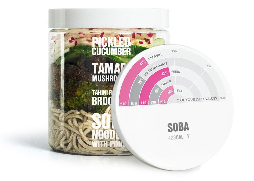
Tyme is a groundbreaking fast food brand that aims to provide consumers with healthy meal choices, catering to those who are on-the-go by serving each meal in an environmentally-friendly reusable jar. The actual transparency of the jars allows consumers to visually identify what ingredients go into a particular meal. As a secondary purpose, each jar lid displays nutritional information laid out in the style of an infographic. This gives consumers additional insight as to what they are putting in their bodies when they consume this particular food.
Incorporating physically transparent elements is only one aspect in which food brands are looking to provide consumers with the information that they want to know. Brands are also looking to utilize the design of the packaging to list out ingredients or state facts about what goes into their products.
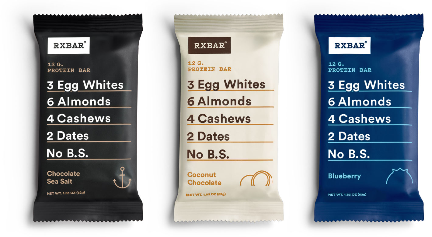
RXBAR is not your typical protein bar as they “tell you what’s on the inside on the outside” of their products. Their packaging is refreshingly straightforward as each ingredient is neatly listed on the actual wrapper of each bar. The brand even has a line of protein bars created specifically with kids in mind, making for an easy way for a parent to make a healthy choice for their child.
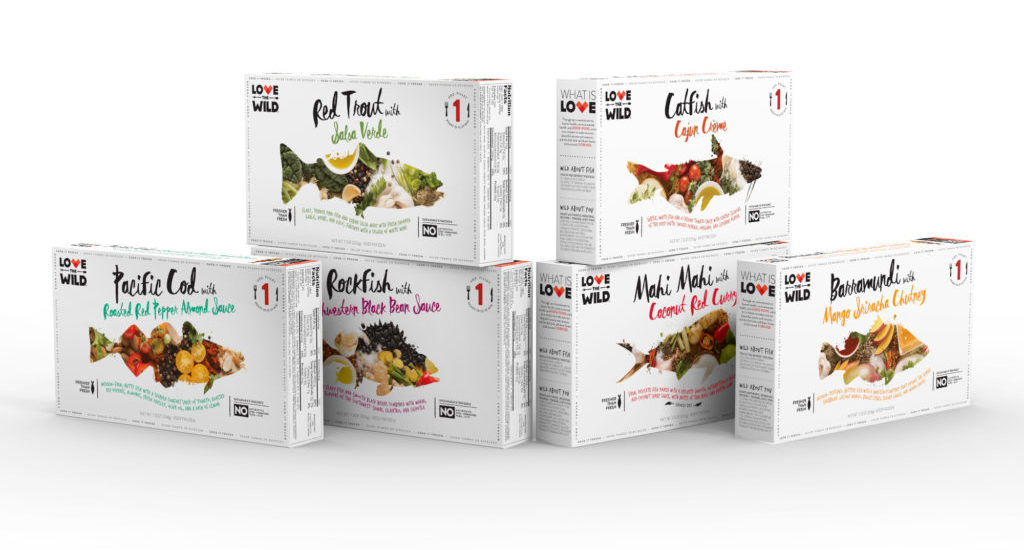
Love The Wild is a company that uses its packaging as a means to relay an ethical message. The idea behind the brand is to provide access to exceptional fish dinners while also creating their product in a sustainable manner, as each fish comes from a farm. This reflects the company’s commitment to caring for the environment, but in order to allow consumers a better understanding of this, the packaging lists the specific farm where the fish was raised. This allows for a consumer to have full access to the origin of the product, making for a “nothing-to-hide” solution that fosters trust for the company.
For brands, transparency will only become more important in the years to come, as consumers have developed a desire to want to know all the details that go into creating a particular product, ultimately striving to make sure that what they see is what they get.
- < Previous What “Raw Water” Teaches Us About Buzzword Overuse
- Next > Lime-A-Rita's Redesign, One Year Later