
5 Designs We Love
5 Designs We Love: E-Commerce UX Design
February 21, 2018 - by Taylor Getler


For many retailers, the e-commerce function of their site is perhaps the most important part of their digital presence. This is the platform that all of their customers will use to do their online ordering, and it hosts the final point of the shopping journey that the brand needs to take with the user. That is to say, it is the brand’s last opportunity to screw up and let the user wander away, frustrated by suboptimal or confusing design. So many brands have lost a sale because they bombarded a customer with an annoying pop-up window, or because they hid the purchasing screen behind a login wall that would force them to create an account to continue.
Great e-commerce design makes it as easy and encouraging as possible for a user to proceed to checkout. While they should feel like they can rely on their information being protected, barriers to pay should be minimal.
Amazon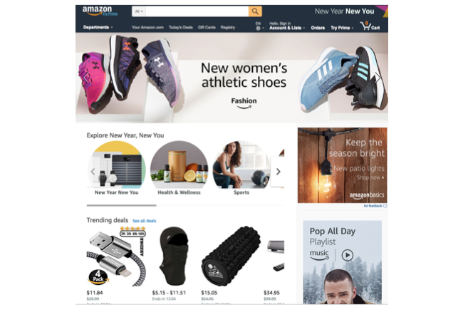
Take, for instance, Amazon. As the biggest e-commerce platform in the world and with a value of hundreds of billions of dollars, they must be doing something right.
Their one-click ordering system makes it possible to make a purchase in a matter of seconds. It is so easy, in fact, that it’s fairly common for folks to buy something from the house while drunk, unaware of what they’ve done until a mysterious (and usually hilarious) package arrives at their home.
However, even Amazon isn’t perfect. You have to have an account in order to make a purchase – there’s no guest check-out option. Although, at this point, who still doesn’t have an Amazon account??
At the very least, Amazon saves items in your cart even if you don’t have an account or visit the site when you aren’t signed in. So when the user is finally ready to create an account, they won’t have to go searching again for whatever it was that brought them to Amazon. That kind of attention to the user experience is what has made them the commercial goliath that has cities all over the country clamoring to host their second headquarters.
Ipsy
As we said, any site that requires users to fill-out a sign-up page is at risk of losing potential customers in the process. For some brands, the format of the purchase necessitates an account, and there is simply no way around it. In these cases, some companies have met this challenge by getting creative.
Ipsy, a popular subscription box service for beauty products, has figured out a way to take a lot of the pain out of the sign-up process by turning it into a fun quiz.
In doing so, it promises to deliver a curated list of products specially chosen to suit the user’s preferences and physical characteristics. The quiz-style method of data collection transforms this typically tedious part of check-out into something fun and reminiscent of interactive content that might be found on a high-end beauty blog, or as part of a women’s magazine’s digital issue.
Apple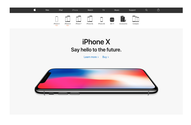
Apple’s features a banner of helpful icons across the top of each product page. Not only do these help users toggle between choices, but they also offer, at a glance, a comparative view of some of the most basic and superficial differences between the models.
Apple also has a helpful, yet un-invasive chat feature, which aids new users who may have questions prior to purchase.
Rent the Runway
Luxury companies are expected to deliver luxury experiences, meaning that high-end brands are often miles ahead of the curve when it comes to digital technologies and user friendliness. This is highlighted in the browsing and ordering section of Rent the Runway, an online e-commerce site that allows users to rent garments that are typically very expensive for a fraction of the cost of purchase.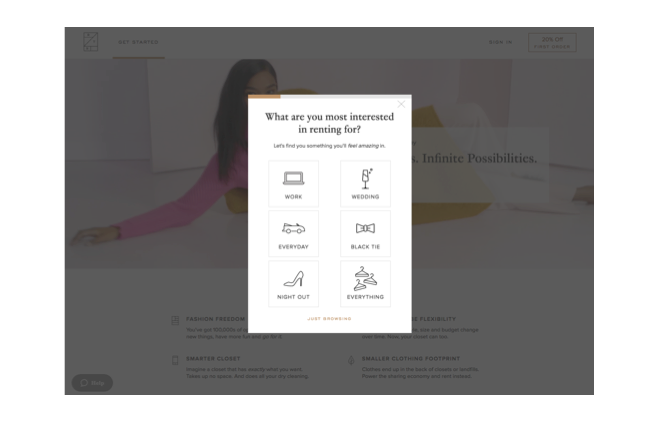
The brand understands that various occasions demand different types of outfits, and their options are sorted accordingly.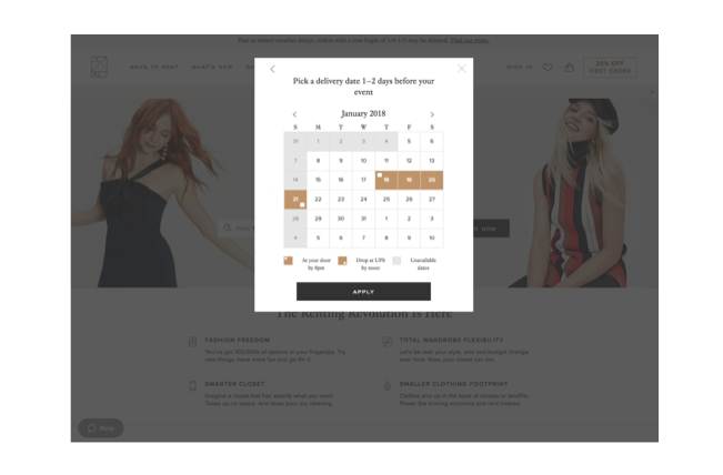
Rent the Runway provides a specialty service not offered by many other companies. To compensate for users’ unfamiliarity with the brand’s core concept, they are extremely comprehensive, holding the customer’s hand every step of the way. They tell users exactly when they should order, when they can expect the package, and how and when the customer can return their garment.
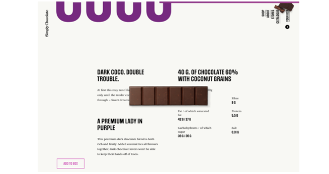
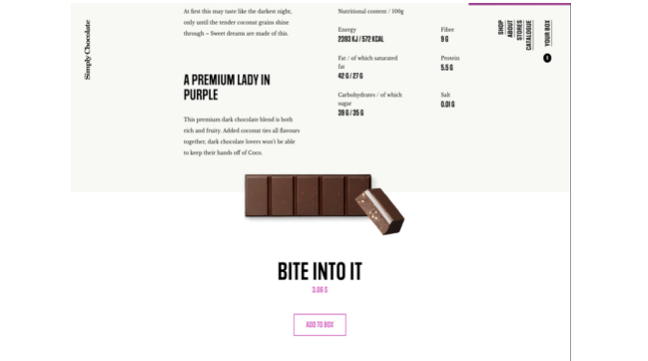
Simply Chocolate
If the user is going to spend a considerable amount time on the site, then the design should be attractive enough to sustain their interest. Danish chocolate company Simply Chocolate utilizes parallax scrolling – where the foreground and background respond differently to scrolling – to create a unique and visually interesting experience. After a user selects a chocolate bar, they can scroll through its page to learn more about it. As they do so, the chosen bar in the foreground gradually unwraps and a piece breaks off, revealing the filling.
- < Previous 5 Designs We Love: Designs from the Fast Food Industry
- Next > 5 Designs We Love: Branded Installations