5 Designs We Love
5 Designs We Love: Natural Food Packaging
April 24, 2015 - by Matt Cannon


As more and more people realize the benefits of fueling their bodies with natural, organic food, more companies are also realizing they need to update their natural food packaging to better appeal to a mass audience. Each of the companies we have highlighted below has found a way to create unique, out-of-the-box packaging designs for the health-conscious consumer.
Harmonian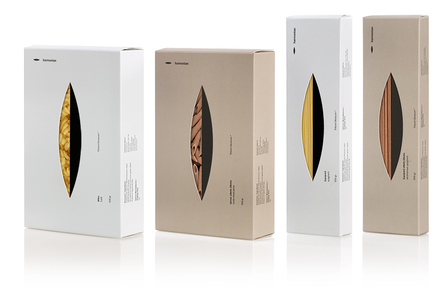
Harmonian offers natural food products with a radical line of elegant natural food packaging. When creating the packaging design, Harmonian wanted something that was as innovative as the products themselves. The packaging was designed by award-winning Greek design studio, mousegraphics, and is simple, but truly one-of-a-kind. They wanted to focus on using space in their design and took inspiration from Lucio Fontana’s Tagli (slash) pieces.
Gaea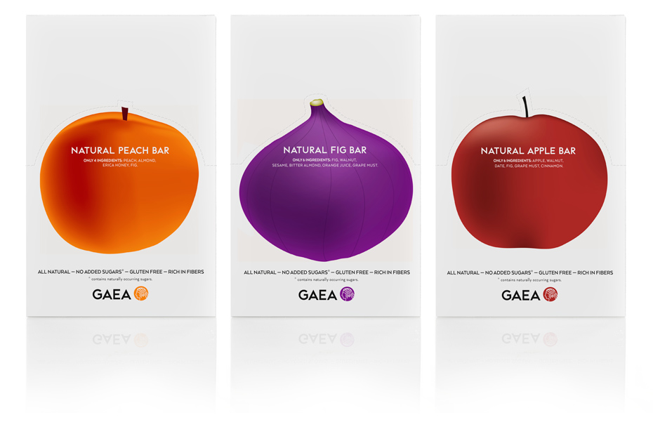
Gaea natural fruit bars take the unique visually striking packaging to the next level. The packaging for each fruit bar is simple, direct, and shows exactly which fruit you will be enjoying. And with only 4-6 natural ingredients in each bar, the fruit itself is the main selling point of the bar. Design studio mousegraphics was tasked with using a “strikingly minimalist” approach and took the packaging one step further by creating unique display stands, which can be punched out around the fruit.
Pipcorn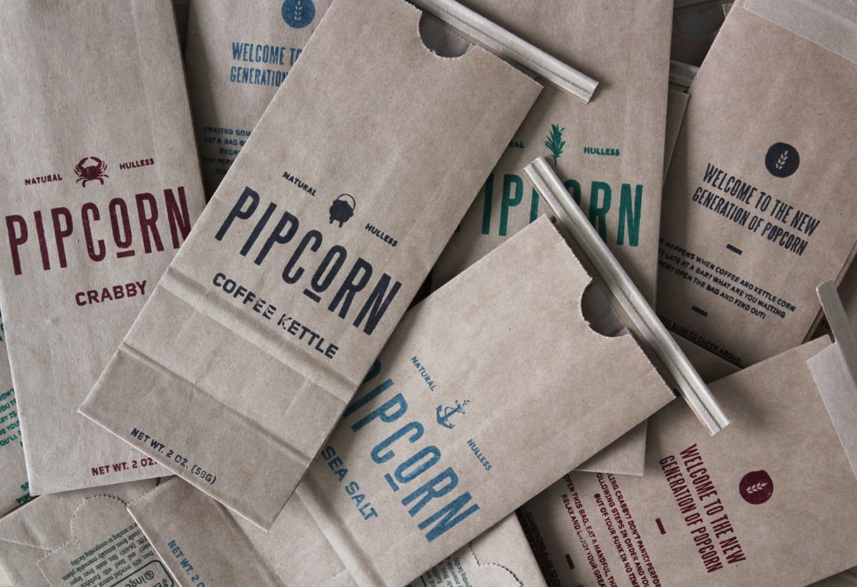
The unique Pipcorn packaging was designed by Noah Collin and Freddy Taylor. The organic, hulless popcorn is housed in simple hand-stamped paper bags that emphasize the homemade approach of Pipcorn. It was inspired by 1850’s wooden, hand painted signage and the traditional brown paper grocery bag.
Rahal Farms Organic Eggs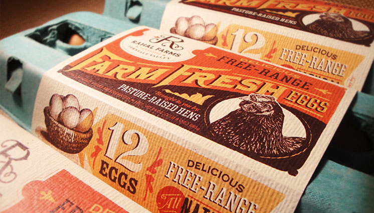
Rahal Farms Organic Eggs are some of the best free-range farm fresh eggs you can get. To reflect the unmatched quality, they turned to Anderson Design Group for unique packaging that would not appear too “earthy”. They utilized colors, lettering, and etched illustrations to create an upscale vintage style design that wraps around the carton. Each carton also tells a story of how happy the chickens are to make consumers feel even better about what they’re eating. While the outer packaging is eye-catching, the egg carton itself is also carefully planned. The recycled carton features a bright teal color so that it can stand out on the shelf. The packaging is also made with recycled paper to further their natural approach.
Munk Pack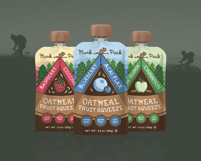
The Munk Pack packaging was designed by creative agency Motto. It is the first every ready-to-eat Oatmeal Fruit Squeeze, but the packaging still feels familiar enough to entice first-time customers. It can appeal to both children and adults with the colorful, simple packaging. The branding also focuses on the friendly icon, an adventurous chipmunk.
- < Previous 5 Designs We Love: Seasonal Branding for Halloween
- Next > 5 Designs We Love: Subscription Box Packaging