Why Digital Designers Should Consider Default Choices
March 28, 2018 - by Garrett MeccarielloDefault choices surround us. They are pre-defined values or options that have been set for us in order to encourage a certain action, such as increasing speed of selection, enhancing experiences, and/or anchoring choices towards optimal behavior. In our day-to-day lives, we rarely stop to think about the choices that we make or the factors that influence our decisions. For example, long before default choices were utilized on the digital front, they have been used by national CPG and fast-food brands to increase brand recognition and revenue.

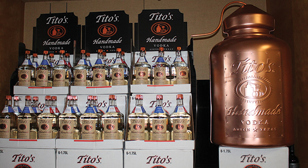
The context in which a decision is framed is equally as important as the choice that is being made. Tito’s Handmade Vodka, a brand that has grown exponentially in popularity in recent years, has creatively positioned their brand as the “default choice” among consumers — a tactic that has proven to be beneficial in increasing sales during a relatively slow vodka market.
Centered between Value and Super-Premium vodkas, Tito’s has focused on owning the “Premium” market space in the consumers’ minds. Through positioning the product as having seemingly been handmade by Tito Beveridge himself, the brand has built a reputation as being an accessible and high quality vodka.
When novel vodka drinkers enter a crowded liquor store aisle, Tito’s stands out as a worth purchase between the lower end vodkas in plastic bottles, and the higher end brands which stand out of one’s price range representing status more so than taste. Those inexperienced with the vodkas’ taste often recognize and choose the signature bottle with notable branding among the competing bottles — reducing friction during the shopping process and encouraging the product’s purchase.
Tito’s Handmade Vodka leveraged their competitors’ market positioning to increase their own sales. By choosing Tito’s, consumers are making a personal statement about who they are based on their choices of what they drink. Little does the consumer know, their choice has been influenced by the context of where they were shopping, long before they recognized their intent to buy.

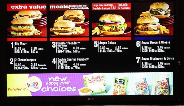
Fast food restaurant menus are not immune from default choices, either. Typically the serving size for an order of French fries at McDonald’s includes a small, medium, and large option. To the average consumer, these sizes do not seem anything out of the ordinary, but to a consumer psychologist, they are a work of brilliance. Say the price of an order of small French fries at a local McDonald’s is $3.00, a medium is $3.50, and a large is $3.75. Based on a decades old marketing campaign, an individual who is purchasing a value meal comprised of a burger, medium fry, and medium soda will be asked if they would like to increase the size of their French fries for only a few cents more. Relative to the other prices on the menu board, the customer sees the value of this additional purchase, and agrees to the increase in size for the nominal fee.
While the customer receives additional French fries in their combo meal, it is actually McDonald’s who profits the most in this exchange. By setting the default choice in the combo meal to be a medium fry, rather than a small, the restaurant was able to upsell the consumer on the small increase in price in exchange for a larger quantity of fries received, at little additional variable cost for the business.
The benefit of using default choices here is twofold. Not only did the consumer not have to think about the size of the fries that they wanted during this exchange while assembling their meal, they were offered additional fries for what appeared to be a value. This example of default choices in action demonstrates the value of simplifying menu choices and anchoring the value of such in the minds of customers- a practice that is beneficial for both stomachs and corporate profits. The health implications of such practices are a different story, however.
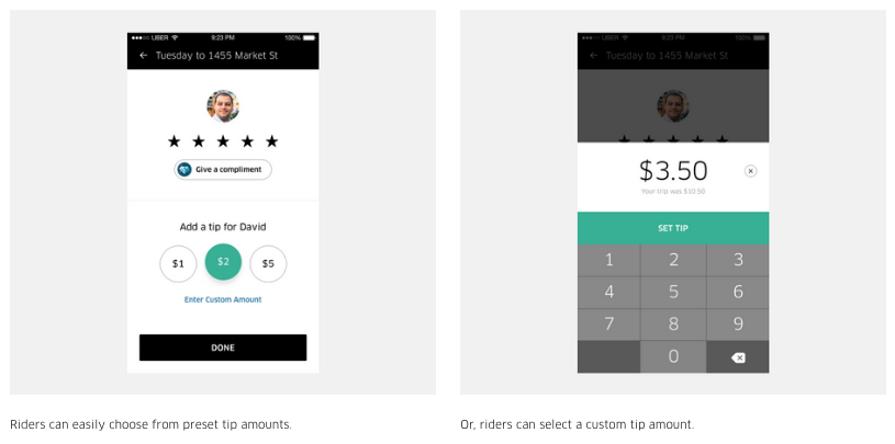
In the growing digital service environment, default choices for tipping options are becoming more and more prevalent. Taking advantage of the social norm that people in the United States tip approximately 20% for services, UI/UX designers have made it even easier for users to complete online or digital transactions. From point of sale terminals to taxi cab payment screens, default tip options are set around the 20% mark, with the ability for patrons to tip above or below the pre-set amount.

Uber and Starbucks, two of today’s largest brands, both employ default tip options within their mobile apps. By automatically calculating 18%, 20%, and 22% of the total for the respective mobile app’s tipping options, the two brands ensure that the experience of leaving a tip is not only easy to complete for the user, but that the employees are taken care of. Often, it is easier for the customer to select the default option and avoid spending time making a decision in a hurried environment. Coupled with the ease of the customer comes the benefits to the business and it’s stakeholders itself. Digital default options strike the balance of being beneficial for consumers and the businesses.
Successfully incorporating default choices into UI/UX design requires a keen understanding of the behavior within which users engage in otherwise unaided situations. These default choices should be implemented to reduce any possible friction encountered in sign up processes, purchasing pathways or other activities that require more than 2-3 actions on behalf of the user. Enhancing a customer’s experience by decreasing time spent on repetitive input increases the competitive advantage over those companies who have yet to harness the power of default choices in the User Interface and User Experience space.
Easy-to-implement methods of default choices in digital interfaces include setting the country of residence option to the United States (if that is where a majority of the businesses’ customers originate), automatically setting refill preferences for monthly orders based on the user’s re-ordering habits, and ensuring that user preferences are remembered upon login. These quick tricks provide an enhanced experience for the user, and benefit the company through decreasing drop off rates through the experience.
Implementing default choices into experience design is a simple process that is often overlooked in favor of enhanced graphics. Default choices enable digital experiences to become enhanced and provide a streamlined experience for all involved. Small instances that might pose a larger annoyance at the outset such as scrolling through a drop down list for a commonly selected item become a breeze when default choices are enabled. When implemented well, default choices allow all of those involved to have a frictionless experience that yields benefits for both the consumer and the brand involved.
- < Previous Why Sound is the New Logo


