5 Designs We Love
5 Designs We Love: Designs from the Fast Food Industry
September 27, 2017 - by Matt Cannon


How do you enhance the customer experience when it comes to fast food? Whether it is a viral campaign or innovative packaging, great fast food design can boost sales and even make people feel better about what they’re eating.
We know that great typography, color schemes, and the overall feel of fast food packaging can improve the dining experience for customers, but some designs really go above and beyond to take the meal to the next level. Here are five creative fast food designs that we think break the mold.
Burger King’s Proud Whopper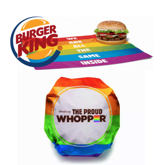
In celebration of the San Francisco Gay Pride Parade, Burger King debuted a “new” menu item called the “Proud Whopper.” While it was really just a normal Whopper with a colorful wrapper, some customers noted that they tasted flavors that aren’t typically present in the signature sandwich, such as sweetness, making a case for the relationship between packaging and the placebo effect.
The wrapper doubled as a rainbow peace flag, with bold copy proclaiming that “WE ARE ALL THE SAME INSIDE.” The campaign was a viral success, with over one billion media impressions and $21 million in earned media amongst seven million views. It also had 450,000 blog mentions and became the number one trending topic on Facebook and Twitter.
Dunkin’ Donuts Chameleon Cup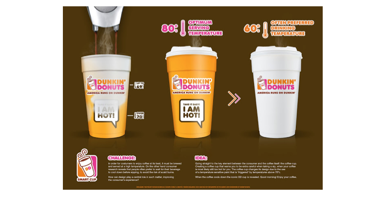
Dunkin’ Donuts worked with designer Tiago Pinto to come up with a solution to a problem that plagues many coffee sellers: how to communicate that the beverage could be dangerously hot in a concise, attractive way.
They wanted to add value to the customer’s experience while making sure that design played a central role in the message’s execution. They came up with a brilliant coffee cup that warns drinkers when the beverage is too hot. A temperature sensitive paint is activated when the temperature of the inside of the cup rises above 70°c. When the coffee cools, the cup turns to Dunkin’s normal white cup and iconic logo.
Pizza Hut’s Blockbuster Box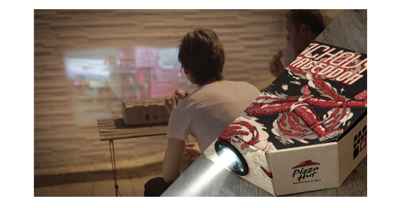
Is there a more iconic pairing than pizza and movies? Ogilvy Hong Kong recognized the value of this match and created a genius marketing endeavor to combine the two with the Blockbuster Box.
The Blockbuster Box contains a special plastic “pizza table” that keeps the greasy goods away from the walls of the box. The table has a built-in lens, which can be slotted through a perforated hole on the side of the box.
Once you’ve inserted the lens into the side of the pizza box, you’ll need a smartphone to power the experience. After you place your smartphone in the center of the Blockbuster Box, the lens will magnify your smartphone’s display and project it onto the wall.
McDonald’s McBike
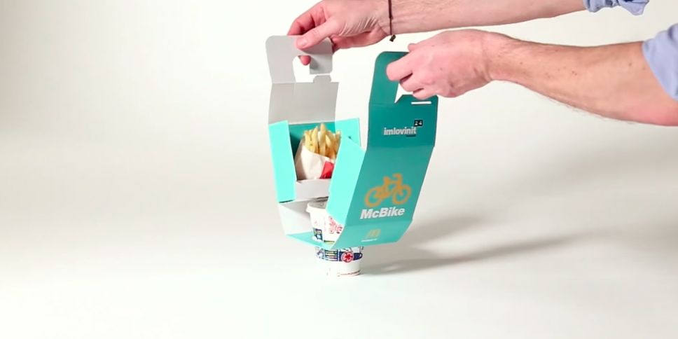
With fast food’s general focus on the drive-thru, it can be easy for quick service restaurants to neglect their bike-riding customers. McDonald’s is there to make sure that cyclists can enjoy the same nuggets as their driver counterparts.
McDonald’s blatantly ripped off by a concept created by Master’s student Seulbi Kim from Rhode Island School of Design, though version features an additional slit that allows the customer to slide the box through handlebars.
According to her portfolio, “Seulbi created the project as a means to carry fast food more effectively and reduce fast-food packaging by 50%”. She told Business Insider that she was not contacted regarding the bag she designed. “It’s cool to have my design out in the real market but also not really cool to have it copied without my permission,” she told Business Insider. McDonald’s could not be reached to comment on the product design.
Taco Bell “Eat Your Words”
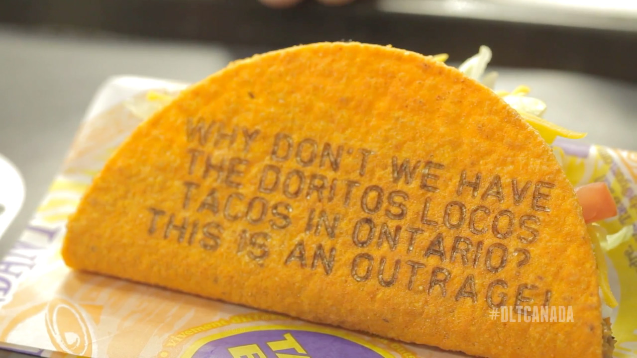
Canadians are passionate about food, especially the items south of the border that are just out of reach. When Taco Bell announced its new Doritos Locos Taco in the USA, mouths and stomachs across the country were united in a glorious tastebud party. Canada was not invited to that party, and they weren’t afraid to express their frustrations over social media.
Tweets like “Every day that goes by that Canada does not have the Doritos Locos Taco at Taco Bell, I die a little more inside” and “Sure #Canada we get free medicare and shit. BUT wheres the taco’s with Doritos as a shell?” were pouring in.
From those tweets the “Eat your words” campaign was born from Taco Bell in collaboration with Grip Limited agency. Once the Doritos Locos Tacos did finally arrive in the North, it was Taco Bell’s chance to literally make them eat their words. Acquiring marginally-advanced laser technology, they etched some of the more colorful social posts onto the actual taco shell itself.
The campaign went viral, countless DLTs were consumed, and even marked one of the greatest moments of some people’s lives.
Next time you are out grubbing on fast food, think of ways that designers could make it a better experience for customers and let us know if you have any ideas.
- < Previous 5 Designs We Love: Sustainable Packaging Designs
- Next > 5 Designs We Love: E-Commerce UX Design