The End of Skeuomorphism?
November 02, 2012 - by ChrisIn a world where there is an increasing dependence on virtual interfaces in the form of computer, tablet and phone screens, there is been a natural desire to hold on to familiar pasts. While a touchscreen device offers unlimited possibilities for interface innovation, we’ve found ourselves peering into a reflection of obsolete pasts–vestigial pieces that only exist to make us feel comfortable about the future. Why is this? In a time where humans are creating new technologies at an incredible pace, we should be focused on how these can best be nurtured rather than weighing them down with our past. In order to free ourselves for true innovation, we need to rid ourselves of our dependence on skeuomorphism.
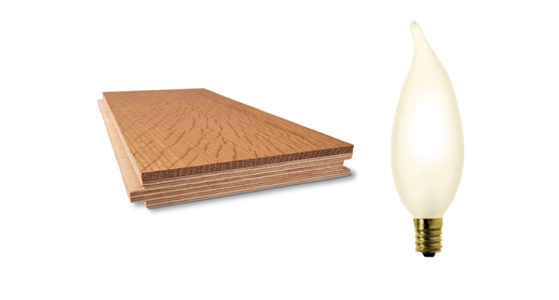
What is a skeuomorph? A skeuomorph is a design element that imitates a feature that was functionally necessary to an original design, while being merely ornamental in its current state. For example, a modern “engineered hardwood” floor may have a printed wood-grain pattern on its surface. While the engineered material is likely a vast improvement over natural wood—with no warping, staining, or cracking to worry about—the idea of real wood is familiar and comforting to us.
After all, few people stand in awe of the perfectly aligned particulate beneath our feet. Another example is window mullions—the dividing bars of a window pane. While at one time these were necessary to divide individual pieces of glass, we now have the capability to produce more efficient glass panels at any size, rendering a grid of smaller panes obsolete. Still, we have a cultural connection to those bars, going so far as to superficially glue them to a window that is perfectly functional without them. This theme is nothing new. From hubcaps to greek Greek columns, pleather jackets to flame-shaped lightbulbs—this idea is instilled in us. It has only been with the rise of the on-screen interface that we’ve seen how deeply engrained skeuomorphism is within human culture. One of the earliest adaptations in the computing world is the file folder. Most of us use tabbed file folders everyday. But, how many of them are physical folders? I see 15 folders on my desktop right now and not a single one is made of paper. Rather, they are made of pixels, and hold nothing but 1’s and 0’s. If you save a document, likely you will be clicking on an icon shaped like a floppy disk. Yet, when was the last time you saved something to a physical floppy disk? I haven’t even seen one in a well over a decade.
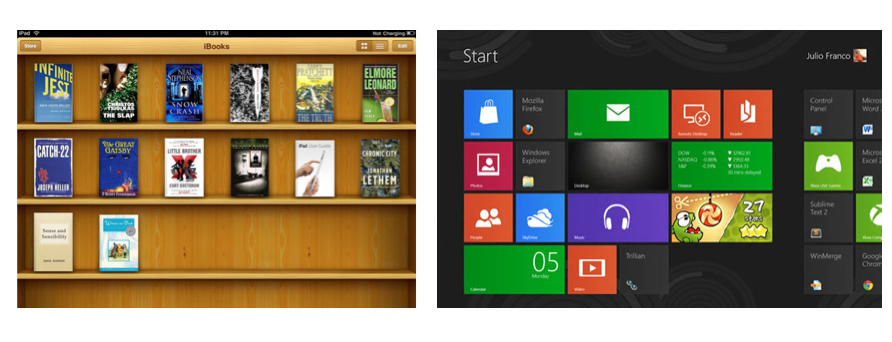
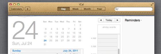
In recent years, Apple has been at the forefront of the skeuomorphic interface. Their iBooks are neatly displayed on a wood-grained bookshelf and all calendar events are posted in a leather-bound planner. Are these visual cues necessary? Will a user lose all reference for their task if they are not reassured by objects from the real world? As a designer, I feel there is a better solution. Microsoft—not known for their design chops—has challenged Apple’s direction with the introduction of Windows 8. With a heavy dependence on typography, blocks of color, and simplified icons, Microsoft hopes to break current trends. This week Apple has taken note, firing their lead software guru Scott Forstall, who along with the late Steve Jobs is a proponent of the skeuomorph. While it has yet to be seen whether consumers will respond well to the lack of real-world reference in early stages, it seems to me that this is the direction that we need to move. We need to embrace technologies as they apply to us now, not as they once did. But what of the future? Will we one day be using some unfathomable device in which its book reader feature looks like an old-school iPad? We’ll have to wait and see.
- Next > Augmented Reality is (Probably) the Next Big Thing


