5 Designs We Love: Body Wash
January 07, 2014 - by Kory GrushkaThe personal care industry has experienced a branding and design revolution in the last decade or so, and one of the most obvious examples of this is the body wash category. Whether targeted to males, females, millenials or octegenarians (must be out there somewhere), the product packaging and branding of this category has become a lot more sophisticated and distinctive in recent years. Here is a look at 5 outstanding designs from that category, along with our thoughts about each.
1. Axe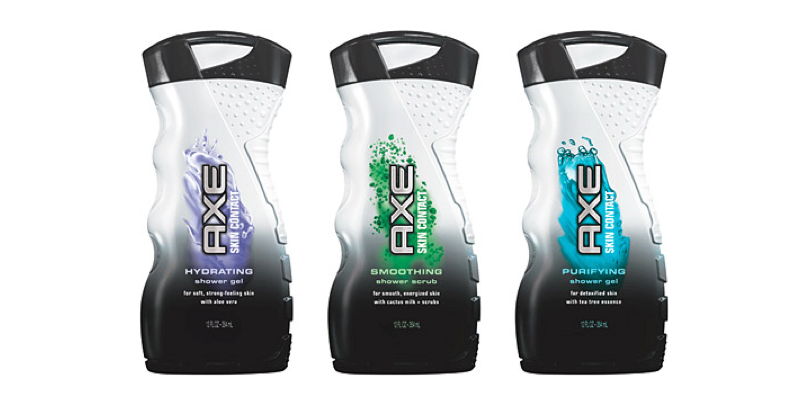
It would be hard to write an article about body wash without a long look at Axe. If you havent watched TV for the last 15 years, Axe is a Unilever brand that focuses on personal care products that are targeted at the 15-25 year old male demographic. In fact, Axe is perhaps responsible for creating the modern day male personal care category. Their marketing and design strategy centers around dynamic and over-the-top imagery and messaging to convince young males that their products will attract the ladies. Their signature product is body spray, but the brand naturally includes body wash with a number of designs such as those highlighted above. What makes these designs so outstanding is how perfectly positioned they are for their target demographic. The curved industrial structure, black and white color contrast and bold typography screams masculinity and strength. These could easily be devices to clean your football cleats, or tazers, or some other modern rugged item that is appealing to males while completely alienating females. And that is exactly what Axe wants: to make cool personal care products, just for (young) dudes.
2. Old Spice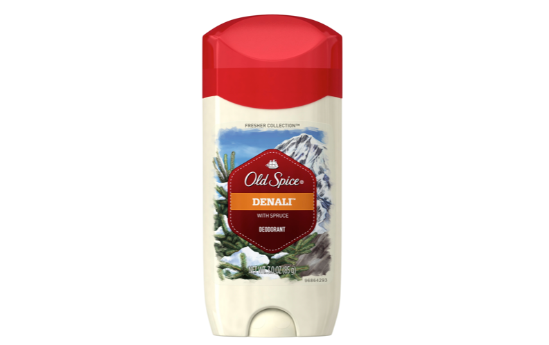
Old Spice is also a personal care brand that has historically been targeted at the male demographic. As an iconic legacy brand owned by Procter & Gamble, Old Spice had a long history and a dedicated consumer base which was probably not the most attractive to the younger male set. To that end, in the mid- to late-2000’s, Old Spice was repositioned as a light-hearted, fantastical and quirky brand, while in 2010 it launched perhaps the most successful online viral video campaign in history. Rather than creating a more industrial and modern brand (a la Axe), Old Spice’s branding was able to introduce masculinity and “chick magnetism” through some unexpected contrast. For instance, the product highlighted above is a body wash from Old Spice’s Fresh Collection. The structure is definitely modern and masculine, but the imagery features a serene landscape illustration in the background with a bold geometric Old Spice stamp on top. The design is able to convey the freshness, masculinity and quirkiness that have become the brand’s signature characteristics.
3. Caress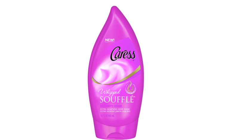
The Caress products above are polar opposites from the Axe and Old Spice products that we previously discussed. Caress, a Unilever personal care brand, is exclusively focused on the female demographic, and the Souffle branded products above are a shining example of that positioning. We love the unique teardrop structure that this product is housed in, and how it is so clearly a feminine product – from the color to the structure to the delicate typography. We wanted to show these designs to show the dramatic contrast between this and the previous male-specific products. But more importantly, we wanted to show how overt the gender-specific positioning is in the personal care category as a whole.
4. Manatomicals
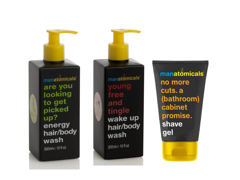
Manatomicals is a male-specific personal care brand from the Maltese company Anatomicals. Like Axe and Old Spice above, these products are targeted to the male demographic. We were struck by the prominent typography and copy on the front of the package that speaks directly to the consumer with pithy comments and/or questions. This type of direct conversation is fairly cutting edge in the package design industry, and is only now starting to be seen on packaging from national brands (Heinz Ketchup, for instance). That said, this contemporary technique is particularly uncommon in the personal care aisle, and we love how distinctive that makes this product (particularly as compared to its competitors).
5. Palmolive Thermal Spa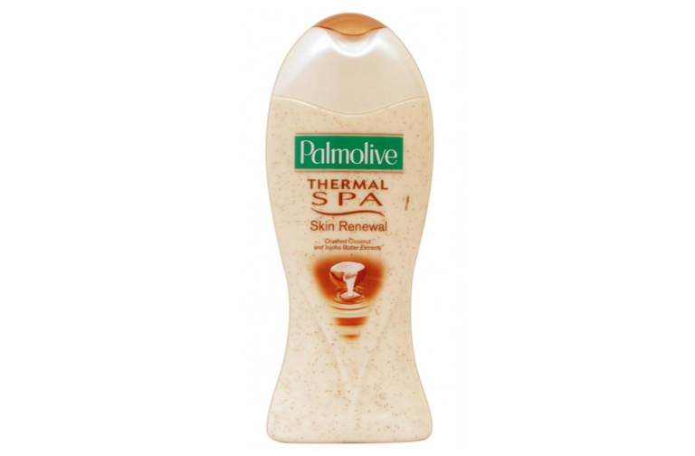
As you undoubtedly know, Palmolive is a brand that has become the iconic dish soap brand. In recent years the brand has been extended into a multitude of product categories, and here we feature a Palmolive branded body wash. We’d be curious to know whether Palmolive has been successful in extending its brand into the personal care aisle (we dont see a natural connection between washing dishes and washing your body), but that is a different discussion. We love this product because of its uniquely feminine and curvaceous structure. Clearly the personal care category is full of distinctive and innovative structural designs, and this product fits the mold perfectly – we thought it was worth highlighting.
- < Previous 5 Designs We Love: Private Label Branding
- Next > 5 Designs We Love: Fresh & Minimal Bottle Packaging


