5 Designs We Love: Cereal Packaging
April 29, 2014 - by Matt CannonIn this edition of 5 Designs We Love, we turn to one of the most memorable and fun categories of food packaging design, and one that we can all relate to: cereal! As you will see, brand mascots are one of the most important themes that run through many cereal brand designs, and that is certainly the case with all of the brands that we highlight below. In a grocery aisle of brightly covered boxes and designs, these 5 have been able to stand out amongst the rest.
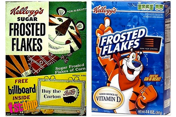
1. Kellogg’s Frosted Flakes
Tony the Tiger has been the widely recognized cartoon mascot for Kellogg’s Frosted Flakes since 1951. Eugene Kolkey designed the mascot for a contest to create the brand’s mascot. Tony the Tiger was originally competing against three other potential mascots, but they were quickly eliminated as the public strongly preferred Tony. As times have changed, Tony has also changed to better appeal to today’s youth. Parents also still get those nostalgic feelings when they see the rebranded Frosted Flakes.
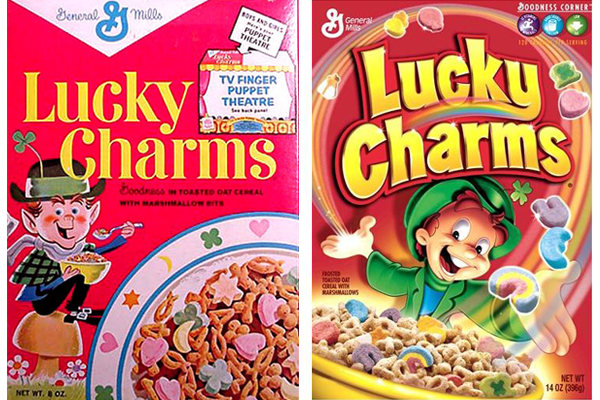
2. Lucky Charms
Lucky Charms has been a long standing favorite with customers of all ages for decades. From the friendly, inviting leprechaun to the brightly colored marshmallows, everything about this box makes you want to pick it up. The leprechaun and packaging have been redesigned a number of times over the years, but still maintains the same basic red and yellow packaging with the leprechaun mascot. Consistently new marshmellow shapes and editions are introduced to keep the brand feeling exciting and fresh.
3. Fresh & Easy Kids Cereals
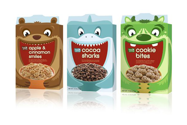 Fresh & Easy has created a unique design for their new children’s cereals. The new packaging stretches beyond the normal box front and onto the flaps of the box to create a large animal or creature drawing. The characters are each eating a bowl of their favorite cereal to better attract children and encourage them to eat the new non-mainstream cereal. Designed by international design consultancy, P&W, the new cereals are able to stand out next to sugary cereals featuring bright cartoon characters that children already know and love.
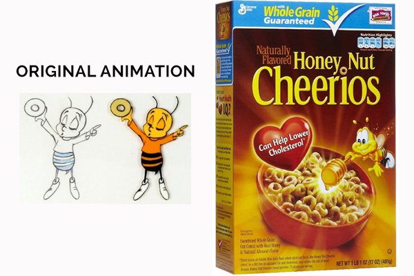
4. Honey Nut Cheerios
After branding Cheerios with minimal packaging, Honey Nut Cheerios was a cheerful step in the right direction. There is no better mascot for a honey cereal than a bumblebee, which is what makes this branding so effective. The friendly bee, colorful packaging, and flavorful drop of honey packaging pulls both parents and children in. Notice how the glow from the design spreads all the way the edges of the box as if the box is being magically transformed. Honey Nut Cheerios remains one of the most popular cereals on American shelves. BuzzBee is aimed towards the 9 – 12 age group and throughout the branding initiatives, can be seen doing things that children around this age would also typically do, but the box not childish enough to scare away the older crowd.
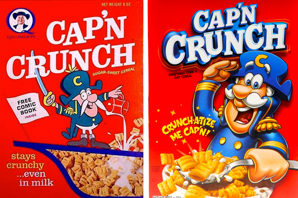
5. Cap’n Crunch
Cap’n Crunch brilliantly chose a friendly captain as their mascot in 1963 and have maintained the same basic image over the years. Combined with the catchy slogan “Crunchatize Me Cap’n”, it made the perfect packaging, branding, and advertising. The bright box features a large image of the mascot enjoying his favorite cereal and inviting the consumer in for a flavorful adventure.
- < Previous 5 Designs We Love: Classic Nintendo Game Covers
- Next > 5 Designs We Love: Sneakers


