5 Designs We Love: Fresh & Minimal Bottle Packaging
January 14, 2014 - by Kory GrushkaIn today’s 5 Designs We Love, we look at 5 bottle designs from the food and beverage world. These designs are incredibly unique and engaging, while conveying a premium feel with minimalist typography, color and design. Enjoy folks.
1. Mikuni Wild Harvest NOBLE
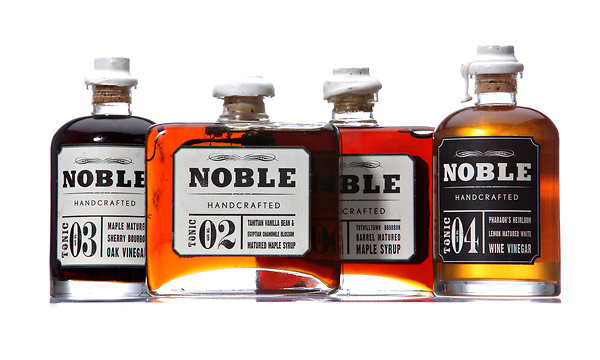 In visual presentation more evocative of top-shelf whiskey brands than traditional breakfast syrup, everything about Mikuni Wild Harvest’s packaging says “premium.” Indeed, the liquor connection is not accidental – the Quebec-based company touts the stuff as “matured in Tuthilltown charred American oak barrels, with just a hint of raw Tuthilltown bourbon.” The cork stoppers, wax seals, and letterpress-like printing channel an old-fashioned apothecary more than a modern kitchen, but the bottle design keeps the focus on the product’s rich, glorious color, and reinforces the brands’ messaging as artisanal, handcrafted and upscale.
2. Gibbs Honey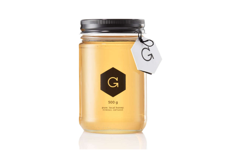
Another tasty example of minimal, transparent packaging, avoiding flashy labeling and busyness to let the product shine. While Gibbs Honey’s sturdy mason jar taps into vintage trends, the stark hexagonal logo really hits the sweet spot, a perfect use of simple shapes to subtly suggest product cues, in this case, a single honeycomb. The blink-twice-or-you’ll-miss-it arrow in the serifed ‘G’ is a great touch, the mark of a skilled designer who understands restraint in branding.
3. Fruita Blanch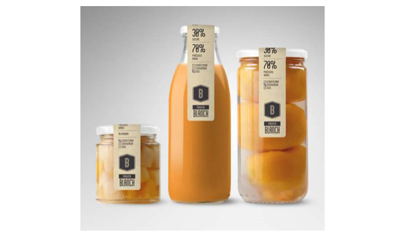
Throwback packaging is all the rage. Fruita Blanch works it to perfection, opting for a single-strip vertical label that doubles as a seal, leaving lots of room for the product to ‘pop’ behind the thick, sturdy glass. Add retro fonts, a muted color scheme, and unbranded white caps, and the overall effect is pure ’50s supermarket chic. The no-frills utilitarian design also effortlessly reinforces the Spanish company’s organic, chemical-free brand messaging.
4. Carlsberg Copenhagen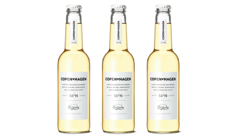
Denmark’s Carlsberg brewery is famous the world over with beer connoisseurs for their award-winning pilsners. But the sexy packaging design of their Copenhagen brand is the true winner, with a crisp, clean look that eschews cliched beer schema, and gives deft nods to high-end wine labels and natural soda brands. The stark black-and-white color palette, carefully-ordered information hierarchy, and understated textual and logo elements oozes classic Scandinavian minimalism, while the stripped-down packaging and clear glass lets the honeyed hue of the liquid speak to us. Pure elegance.
5. Zúmex Pack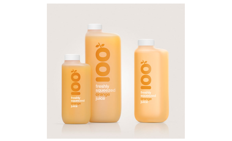
With a sleek ergonomic bottle constructed from ultra-durable translucent HDPE plastic, the industrial design of the Zumex Pack might appear more akin to motor oil than orange juice, but don’t be fooled. The genius of the packaging is that it never forgets its functionality and context: after food vendors purchase a Zumex juicer, the Pack bottles are ordered and distributed in cases, meant for en mass store display. The citrus inside the bottle makes the sale. And c’mon, when Helvetica marries maximum usability, the fruit of the union is always beautiful!
- < Previous 5 Designs We Love: Body Wash
- Next > 5 Designs We Love: Movie Poster Designs of the 70's


