5 Designs We Love: Subscription Box Packaging
September 23, 2016 - by Matt CannonThe subscription box industry has increased in popularity by 3,000% in the last three years, so subscriptions have upped their game when it comes to both the box’s contents and packaging. Strong subscription box packaging can inspire loyalty and add to the overall box experience. Along with standing out visually, each box must also take care to ensure that the contents will arrive at your door in perfect condition.
The outer packaging is the first thing that subscribers see when the box arrives (and while it sits outside of your door), so it’s crucial that the space is well utilized. In essence, it’s traveling ad space. Each of the boxes we have highlighted below has found a way to create unique, out-of-the-box packaging designs that help them stand apart from the rest.
Loot Crate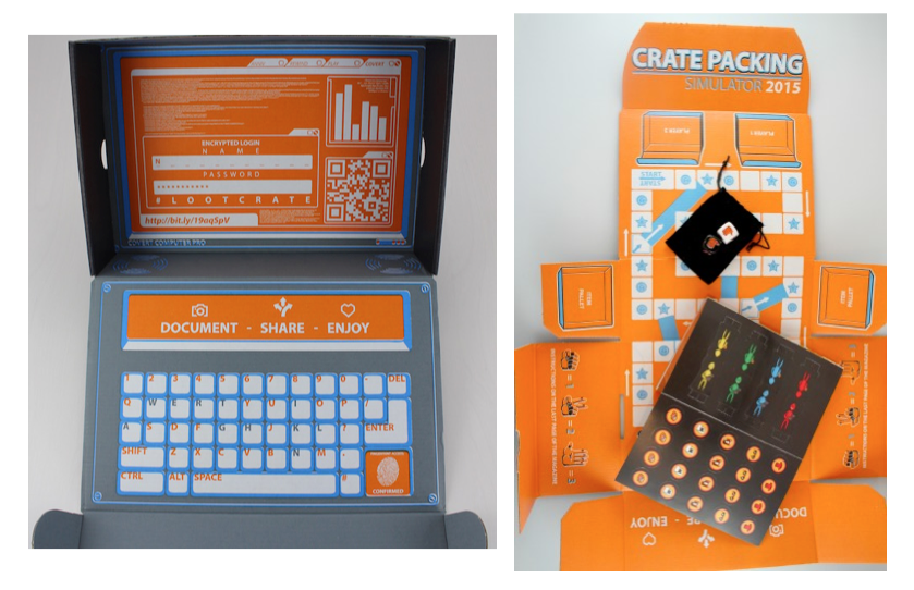
Loot Crate features fun packaging, aimed at gamers, nerds, geeks, and techies. The packaging is different every month and is part of the fun. Some boxes feature a game board on the inside, some correlate with the box’s contents.
According to Chris Davis, CEO of Loot Crate: “We didn’t want to have just some generic shipping box – we wanted to create an emotional connection.” He stated that the packaging is “a direct reflection on our brand. It shows our attention to detail; it’s really cool and sleek-looking (black exterior and bright orange interior), and is a key part of what we do.” To encourage subscriber sharing, they “designed the box internally, and intentionally included ways for our subscribers to connect with us and with each other. The sides of our shipping box have Loot Crate hashtags, and we added a Konami code (probably one of the most memorable experiences for those of us that played Contra–or at least heard about it) on the bottom, as well as a QR code on the back. The codes take users to “secret” video and content.”
Mantry
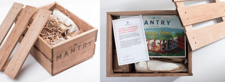 Mantry’s box for foodies designed their packaging to suit the modern man. The contents arrive in a wooden crate with the tops nailed shut. After prying open the box and enjoying the contents, the crate can then be repurposed later and suits basically any decor.
Svbscription
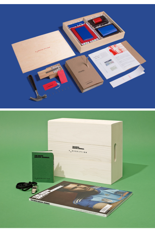 Everything Svbscription does is revolved around style and design. The luxury subscription box includes their branding on almost everything included in the box. The typography, packaging, and logo design were created for the modern man by New York’s RoAndCo Studio. The contents inside are also geared towards those who appreciate design. RoAndCo explained that they “packaged the items in natural wooden crates, nailed them shut and wrapped them in brown kraft paper for shipping.” Each quarter, the packaging changes to fit the box’s theme and content.
Graze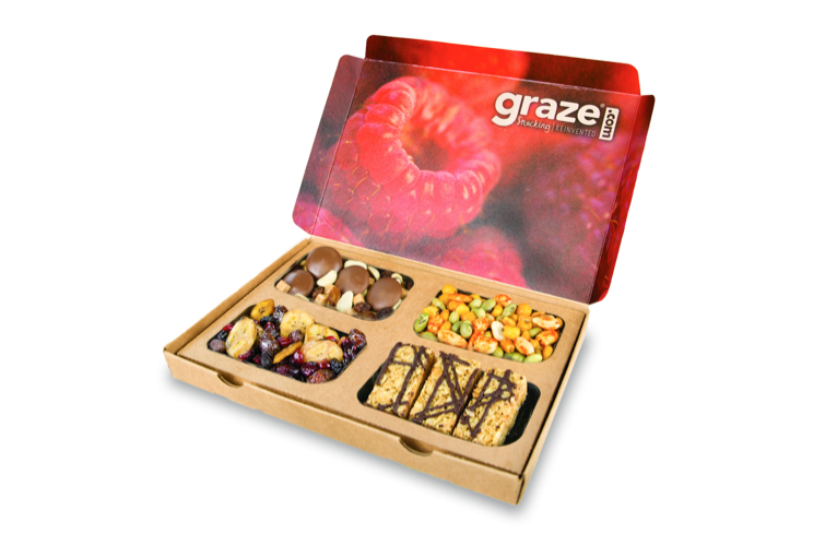
Graze designed their packaging to tell a story. Shelly Huang, Head of Marketing at Graze, said that “the box is one part of the journey” and they take efforts to put a lot of “love and care” into the box and packaging. They use as little cardboard as possible for the outer packaging and the snacks are individually packaged in small sustainable containers. The recyclable packaging and containers can also be reused for different things (Graze suggests using them as bird feeders, herb planters, drawer separators, or arts and crafts organizers).
HelloFresh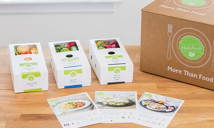
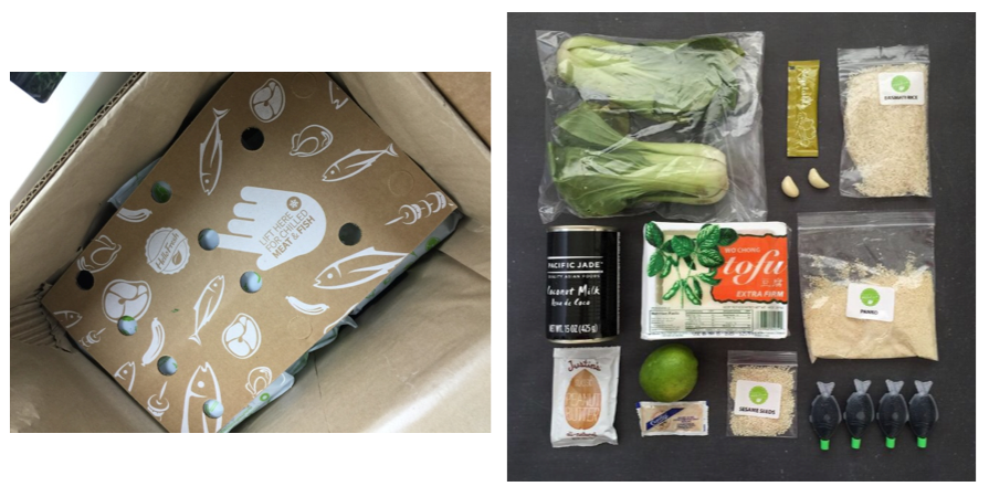
HelloFresh sends individually wrapped, pre-measured ingredients in large square boxes. They are usually preserved with freezer packs and include recyclable packaging. The simple packaging includes stickers that can be viewed from all angles, stating which recipe the ingredients are intended for. The stickers are color coded to match the ingredients inside, so you can easily find what you need to prepare your meal. The outer packaging is intended to look nice and eye-catching in any fridge, while still preserving the ingredients inside for at least three days. The 2-piece box has a finger hole for easy opening and the lid can be used as a trash box while the bottom houses the ingredients.
Adrian Frenzel, Co-CEO of HelloFresh, said that “packaging is enabling.” They are constantly improving and testing their packaging, so that the ingredients arrive at your door in perfect condition every time. The packaging and boxes are even tested out on the exec’s wives, so they get firsthand input from busy moms.
- < Previous 5 Designs We Love: Natural Food Packaging
- Next > 5 Designs We Love: Experiential Package Design


