5 Designs We Love: Vodka Packaging
November 05, 2013 - by Kory GrushkaIn our second installment of the “5 Designs We Love” series, we would like to highlight a number of creative designs in the world of vodka bottle packaging design. When it comes to driving sales and building brand equity in the spirits world, package design and advertising are often more important than product quality (one notable exception is Tito’s Vodka, which has exploded onto the scene without premium package design and with precious little advertising). Most packages in the vodka category feature clear or clouded glass bottles, and most brands compete with sexy, simple and premium designs. Differentiation is the name of the game, and also a very difficult feat to accomplish. Below are some examples of designs that got it right.
1. V2O Vodka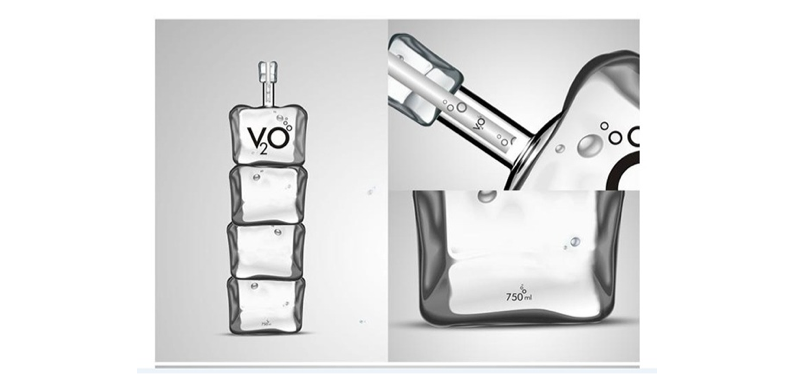
We’re not really sure if this vodka is a concept or a commercial product, but the packaging is really awesome in any case. V2O seems to be an Indian brand that was created by Black Pencil India, a division of Leo Burnett. It features a memorable structural design that looks like ice cubes stacked in a tower, with the bottles ranging in size based on the number of stacked cubes (from one cube at 125mL to four cubes at 750mL). This design conveys a crisp, simple and unique look & feel with an eye-catching bottle that introduces a certain “wow” factor on the shelf. Simply put, this package design embodies real differentiation in a sea of sameness.
2. Crystal Head Vodka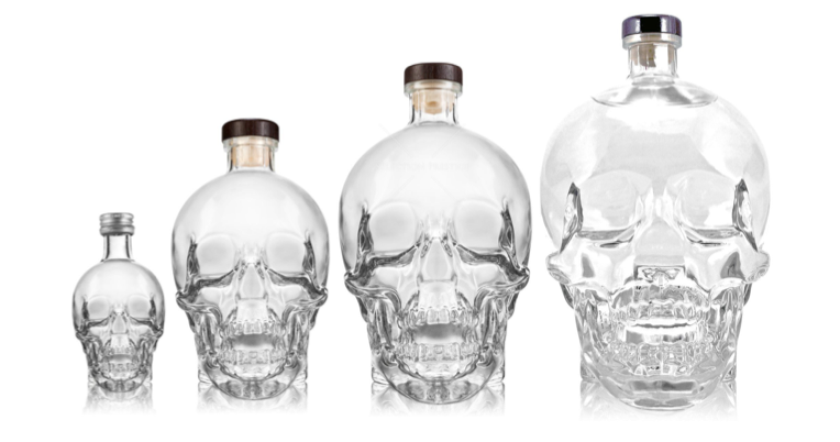
Crystal Head Vodka is a Canadian company founded by Dan Akroyd (yes, that Dan Akroyd). The vodka is quadruple-distilled and seven times filtered, with the final 3 filtrations through Herkimer diamond crystals. The bottle, shaped like a crystal skull, was designed by artist John Alexander (Akryod’s co-founder), and is manufactured by Bruni Glass, a Milan based glass manufacturer. Similar to V2O Vodka above, we love this package design because of its unique shape and distinctive look. Its not your average vodka bottle, and curious to see if this will inspire other brands to experiment with unique glass structures in the vodka category.
3. Anestasia Vodka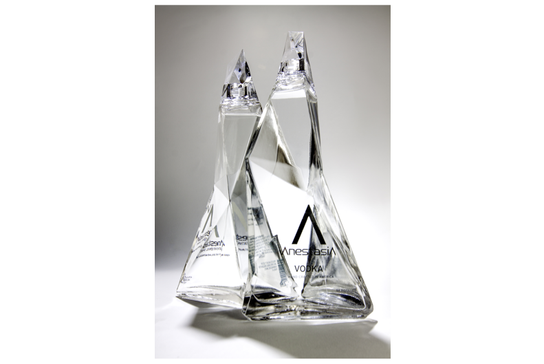
Anestasia Vodka is an American vodka brand founded in 2012 , and that is distilled in Bend, Oregon. Similar to the two vodka bottles above, the bottle structure itself is a distinctive and memorable shape, and is definitely differentiated from all the other clear glass vodka bottles on retail shelves. It features a series of geometric faces to create a natural looking clear glass bottle that resembles a mountain or stalagmite shape. The structure was designed by Karim Rashid, the famed industrial/interior/graphic/everything designer.
4. Frozen Ghost Vodka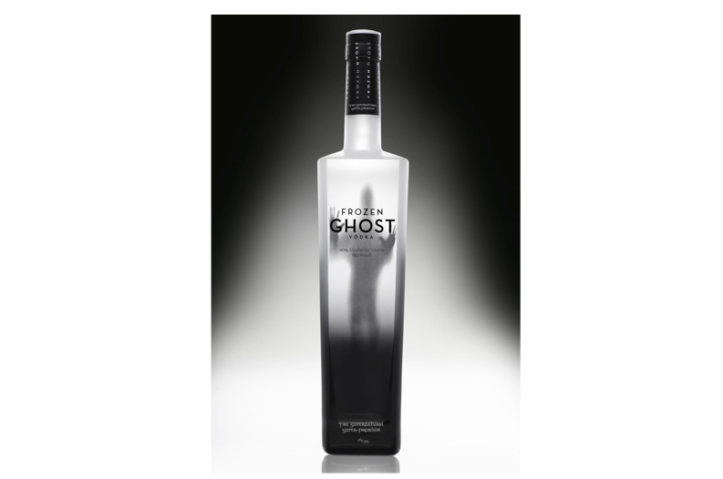
Frozen Ghost Vodka, a premium vodka launched a few years ago by Frozen Ghost Distilling Company, introduces storytelling and a dramatic visual effect into the vodka packaging world. This vodka is packaged in a clouded glass bottle, but the front of the package features something that is both intriguing and memorable: a haunting silhouette of a ghost trapped in the bottle. This image relates to an old ghost story from Western Canada, and there is a long drawn out story that we will save for another time (you can read about it here if youre interested). In any event, we love the storytelling aspect and the shelf impact that this packaging brings to the table.
5. Fris Vodka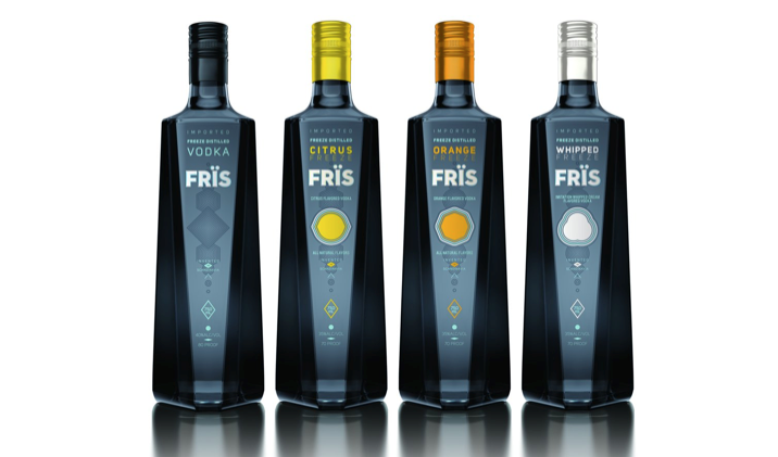
Fris Vodka is a Danish Vodka brand owned by the Absolut Company. We wanted to point this packaging out despite the fact that its neither as dramatic as some of the packages highlighted above, nor as beautiful or premium-ish as many other designs on the market (see clear glass bottles from Ciroc, Belvedere, Absolut, etc). The reason this package design excites us is that Fris deviated from the clear or cloudly glass bottle designs that represent 90% (just our guess) of vodka bottles on shelves today. Fris, like Skyy and Svedka, opted not to focus on the clear liquid inside the bottle, but instead created an opaque bottle with a bold shape and a solid dark blue color. This design is memorable more because of what it does not have (a clear glass bottle) than what it does have (a clean, dark, premium package design that de-emphasizes the product).
- < Previous 5 Designs We Love: Cookie Packaging
- Next > 5 Designs We Love: Chips & Crisps Packaging


