5 Designs We Love: Retail Displays
May 18, 2018 - by Taylor GetlerWe love it when brands get creative with how they display, demonstrate, or promote their product. Not only does it help break up the typical shopping trip for consumers, it can also create a memorable experience that will stick in their minds long after they’ve left the store. Here are five of our favorite installations created by brands.
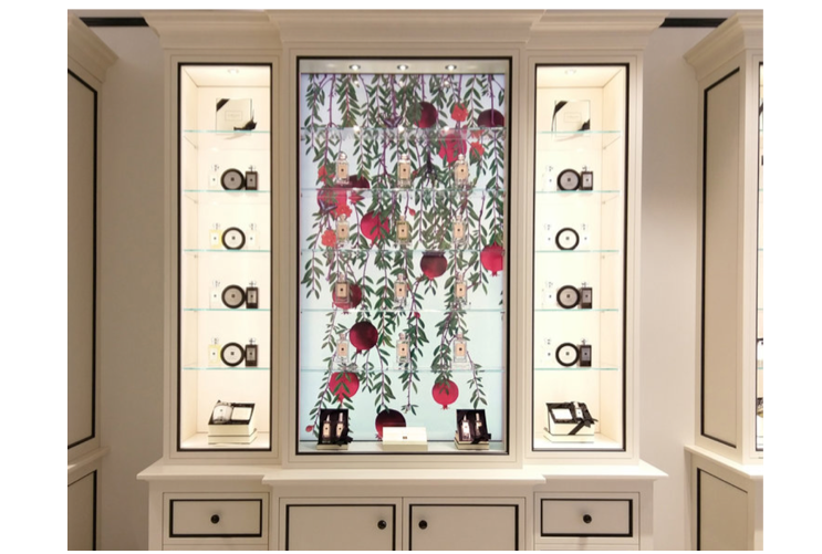
PERCH Interactive for Jo Malone


We could have chosen any of PERCH Interactive’s retail digital displays as one of our favorite POP designs, but the one that they did for Jo Malone is particularly special. This cabinet is outfitted with an interactive screen, and when a customer selects a fragrance off the shelf to try, the corresponding floral notes blossom and bloom. The flowers were custom illustrations, creating a truly unique and magical experience for the shopper.
Flowerbomb

London-based designer Tommaso Nicolao took the name of Viktor & Rolf’s perfume “Flowerbomb” literally with this extravagant display. With huge gold roses pouring out, it’s impossible for shoppers not to notice this striking setup.
Macallan’s Holographic Display

Macallan’s impressive holographic displays can be seen in over 20 locations around the world. The display uses Dreamoc technology, blending CGI with live-action images. For such a classic product as distilled whiskey, such a sci-fi campaign is a very interesting choice that shoppers are unlikely to soon forget.
Neiman Marcus’s Memory Mirror

When it comes to integrating digital technologies into retail settings, both beauty and luxury goods sellers tend to be way ahead of the curve. Case in point: Neiman Marcus’s “Memory Mirror”, which allows shoppers to try on an outfit, take a 360 degree look at themselves, and compare it side-by-side with another outfit that they’ve tried on.
Not only is this a novel in-store feature, it is also extremely helpful for the types of shopping trips that consumers are likely to take. Stores like Neiman Marcus carry comparatively expensive clothing, and as such, it stands to reason that shoppers are going to be pretty selective, even if they do decide to buy multiple items. This tool assists them in making a decision, adding an extra layer of utility and function to an already-innovative display.
Christofle Storybooks

In 2012, Christofle Paris displayed a series of gorgeous, towering storybooks to display their housewares. They debuted at Christmastime, pulling from the themes of magic and wonder usually associated with the season while being completely original in aesthetic execution. Beautifully detailed, they capture shoppers’ imaginations while also effectively promoting Christofle’s products.
- < Previous 5 Designs We Love: Branded Installations


