5 Designs We Love: Cookie Packaging
October 30, 2013 - by Kory GrushkaToday we would like to kickoff a series of articles where we review 5 snack food packaging designs that we love, or at least really like. Below are 5 examples of awesome package design in the cookie category, in no particular order.
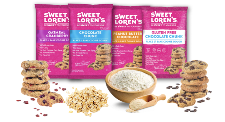
1. Sweet Loren’s Cookie Dough
While not quite ready-to-eat cookies, Sweet Loren’s makes frozen cookie and brownie dough that is sold at select Whole Foods stores and a number of other specialty retailers. What we love most about this package design is the use of varied typography (with an engaging layout), bold colors, and product photography that has a ton of appetite appeal. While the front of the package is a bit cluttered, its contemporary design is a far cry from what you would expect to see in the frozen dessert section.
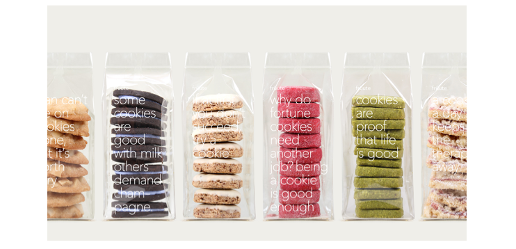
2. Fruute Gourmet Cookies
Fruute Gourmet Cookies and Gift Baskets is a Los Angeles-based company that makes very high end cookies and gift baskets. They have an amazing website with a simple and clean interface and incredibly appetizing photography… definitely worth a visit. That said, it was their package design that really impressed us. It features a clear plastic bag with minimal yet witty copy on the front of the package. Presumably these are not sold on store shelves, but in any case the packaging screams super premium and of course emphasizes the products themselves. They are almost like little works of art.
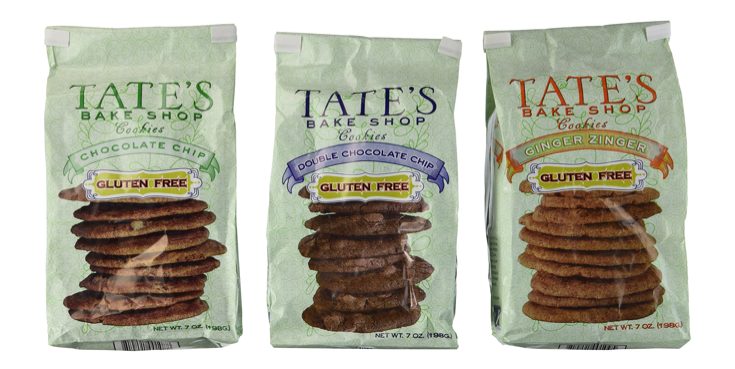
3. Tate’s Bake Shop
An oldie but goodie, Tate’s Bake Shop is a gourmet cookie company that sells crispy cookies in high-end specialty shops. We have loved their cookies for quite some time, and their packaging has always intrigued us. The simple and prominently displayed brand name coupled with the light green background really tends to distinguish itself on the shelf. Its not the most exciting and modern brand, but its very distinctive and functional. While you might not have tried Tate’s cookies before, you may recall seeing them on store shelves.
4. Botanical Bakery
We love the package designs for Botanical Bakery’s line of shortbread cookies, which feature a number of unique herbs and spices (cardamom, lavender, etc). Each package has a leaf positioned to depict a set of feminine lips, and the varieties are color coded and represented by large illustrated typography. The packaging contains no product photography, presumably because the products themselves (shortbread cookies) are not visually appealing. That said, the packaging has an irreverent feel that complements the product’s exotic flavor profiles, and we’re into it.
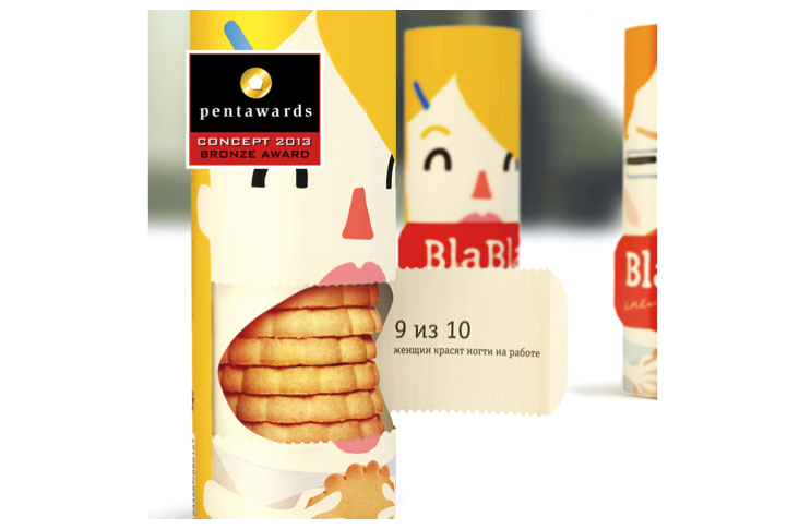
5. Bla Bla Cookies (a student project)
This last design is not a snack food packaging item that you will find on store shelves, but rather its a conceptual work from a group of Russian students from Moscow. We love the fun and cheeky theme (shutting up cartoon characters by stuffing their mouths with cookies), and how the packaging functionally ties in to the theme (by opening and closing the package). We have seen many versions of stacked cookie packaging (mostly from Europe), but we’ve never seen anything like this. Pretty cool, and worth sharing in any case.
- Next > 5 Designs We Love: Vodka Packaging


