5 Designs We Love: Chips & Crisps Packaging
November 25, 2013 - by Kory GrushkaWhen it comes to snacks in a bag, everyone has their favorites and people can get testy about them. But not us. We love them all – Lay’s, Herr’s, Ruffles, Doritos, etc… all good in our minds. In the article below, we are not passing judgment on the products themselves, but rather, we are just highlighting some truly awesome designs in snack packaging world. In fact, we have not even tried most of the chips referenced below. We just think their branding and packaging looks awesome. Purely business, not personal.
1. San Carlo Potato Chips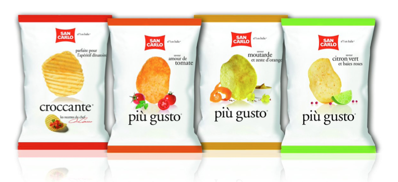
San Carlo is a large Italian snack food manufacturer that has been around for 80 years. They sell their products throughout Europe and other parts of the world (though not in the US). As you can see, these designs are flat out awesome. San Carlo takes the simplicity trend to the extreme here – each variety features a light/white background, a single product photo and bare minimum text. The design is somewhat similar to what Lay’s has done with their latest designs. Not sure what the Italian snack shelf looks like, but this presumably allows San Carlo to own the color white in this category. Additionally, the shadows behind the chips create depth and really make the chips pop off the package. This is an amazing example of how simple design taken to the extreme can make a product stand out in a sea of bold colors and typography.
2. Tesco Tortilla Chips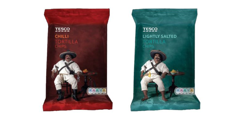
What’s not to love about these designs? They were created by Tesco, the UK-based supermarket chain that is the second most profitable retailer in the world (after Wal-Mart). The majority of Tesco’s products are private label, and these chips demonstrate how creative Tesco gets with its packaging. While we love simple design, we also love engaging mascots. And Tesco succeeds on both of counts here. The engaging mascot is a Mexican-looking man lounging beside a bowl of tortilla chips. At the same time, the package contains absolutely no unnecessary visual clutter, with the only additional elements being a basic product description and brand name. As an aside, pretty amazing for a private label design, isnt it? Not what you expect to see from store brands in the US, thats for sure.
3. Real Handcooked Potato Chips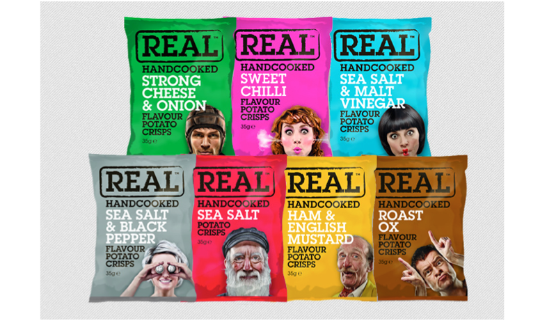
Continuing with the mascot love, have a look at these designs from Real Handcooked chips. They are also a UK company, and these packages use mascots to differentiate between the varieties, along with bold solid colors. In this case, the mascots are funny people with unique personalities. These designs are irreverent, but they are extremely memorable and certainly stand out on the shelf.
4. Darling Spuds Chips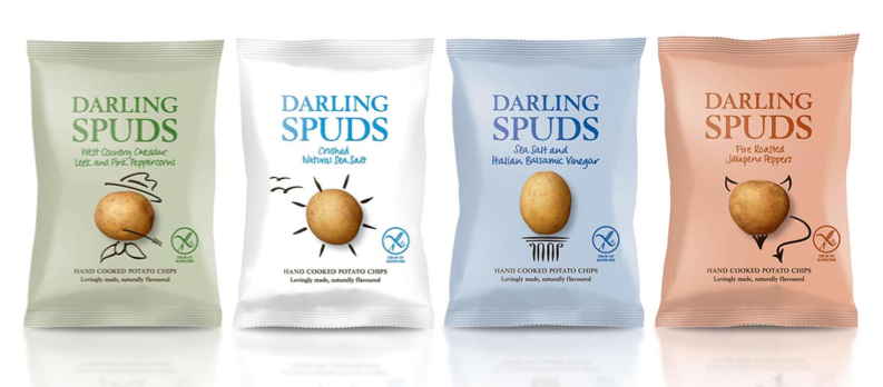
We now have a hat trick of UK-based companies in this list, as Darling Spuds is yet another UK-based company (though you can find these in US stores). These chips come in a variety of flavors, and they are marketed as healthier, natural chips that are 20% lower in fat that regular potato chips. The packaging here also centers around a mascot, but this time it’s a round potato decorated with some sketched lines that create unique personalities. This is yet another example of beautifully simple snack packaging, with the focal point being the potato and the secondary element being the brand name. Simple, elegant and playful wins the day here.
5. Food Should Taste Good Chips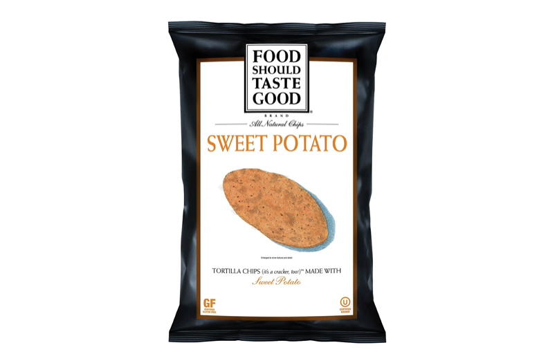
Food Should Taste Good is an innovative all-natural snack brand that makes some very unique chips. They have been a prominent player in the natural snack food category since 2006, and the brand was acquired by General Mills in 2012. They were innovators in this category while using ingredients like chocolate, sweet potato and flax seeds. They have been on our radar for years, and we have long admired their products and designs. Notably, most of their varieties feature illustrated individual chips with drop shadows. In addition to the illustrations, their design signature is also a solid dark frame around a solid white background for most of their packages. The text is minimal and elegant, and the designs evoke a very refined, premium feel that was not all that common when they first hit the scene. These guys are an oldie but goodie.
- < Previous 5 Designs We Love: Vodka Packaging
- Next > 5 Designs We Love: Private Label Branding


