5 Designs We Love: Private Label Branding
December 04, 2013 - by Kory GrushkaThe world of private label branding has experienced a (not so) quiet revolution in the last 10+ years. Gone are the days where “store brand” or “private label” meant stale products, low quality and copycat designs meant to trick you into buying a knock off of your favorite national brands. Many retailers today are committed to turning their own products into distinctive brands that can stand on their own against their national brand competitors. Here is a look at 5 retailers that have led the charge in the private label renaissance.
1. Walgreens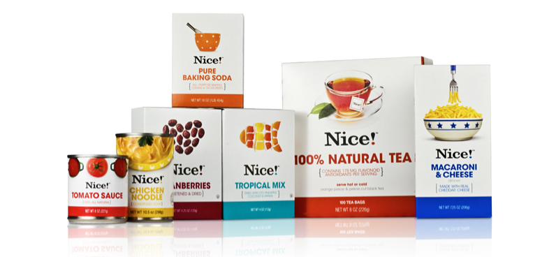
Walgreens has become one of the key players in the transformation of private label branding. Their Nice! brand clearly demonstrates their commitment to creating distinctive designs and to building brand equity. The packaging features highly stylized and irreverent photography, and minimalist layouts with clean and sophisticated typography. They maintain consistency across their product lines, while they use color and photography to differentiate between product categories. Moreover, Walgreens has not only innovated with their branding and design, but also with product marketing. For instance, they recently sponsored a broadcast television show to promote another one of their featured brands, Good and Delish.
2. A&P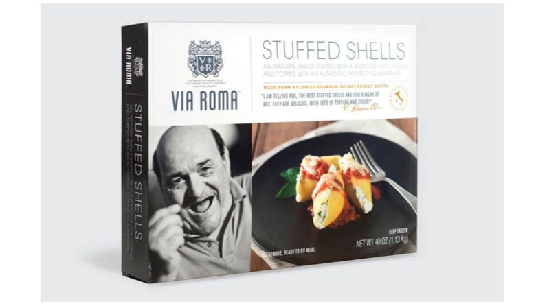
A&P, a grocery chain based in Northern New Jersey, has historically been a pioneer in private label branding. They created Eight O’Clock Coffee, the prominent coffee brand that was eventually sold off and is now an independently owned brand. A&P has a number of private label brands that are contemporary in design, and their Via Roma brand is a perfect example. A&P launched this brand in 2009 as a line of high end italian products, while consolidating many of their Italian food products into this new and bold line. The brand reflects a commitment to brand building through contemporary design and packaging. It features clean design, beautiful product photography, and extremely evocative black and white photographs of older, charismatic Italian personalities (A&P’s design agency actually travelled to a small village in Italy to capture these images). The brand is extremely enticing and distinctive, and compares favorably against just about any packaged Italian food products we’ve seen from a design perspective.
3. Safeway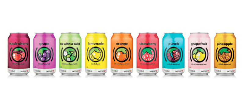
In 2005, Safeway, the #3 grocery chain in the US, committed to a $100 million overhaul of its entire private label brand portfolio. In the years since, Safeway has launched a number of outstanding brands under their own labels, and their efforts have been at the forefront of the private label renaissance that has shaped the industry in the United States. The images above show a couple of categories – fruit flavored sodas and potato chips – and these are great examples of just how far the Safeway team is willing to push the envelope. These look nothing like the stale graphics that are typically seen on most fruit flavored soda packages. And moreover, the potato chip designs are very modern and playful, while turning the chips into distinctive characters that serve as mascots. These are great examples of just how innovative Safeway has been, and how they lead the way for other retailers in the private label world.
4. Waitrose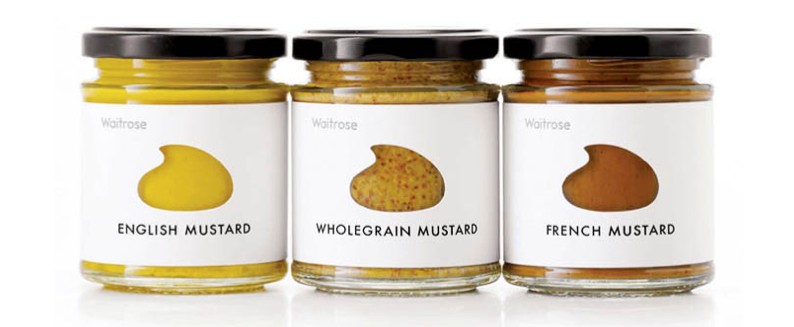
So its not really fair to point to one European private label brand and say that it stands out from the pack. The fact of the matter is that Europe’s private label industry is incredibly well developed, and their private label brands are some of the most creative and cutting edge brands in the world. Retailers such as Tesco (UK), Aldi (Germany), Lidl (Germany), Carrefour (France) and Albert Heijn (Netherlands) have sophisticated private label portfolios, with creative packaging and design and extensive marketing strategies. That said, we were particularly impressed with a number of brands that have been developed by Waitrose, a premium retailer in the UK that has a variety of store brands across many categories. The mustard designs that we included above are not necessarily the best designs in the private label world… rather, they’re intended to be representative of the creative, minimalist and cutting edge designs that Waitrose uses to build their brands and to keep them fresh.
5. Publix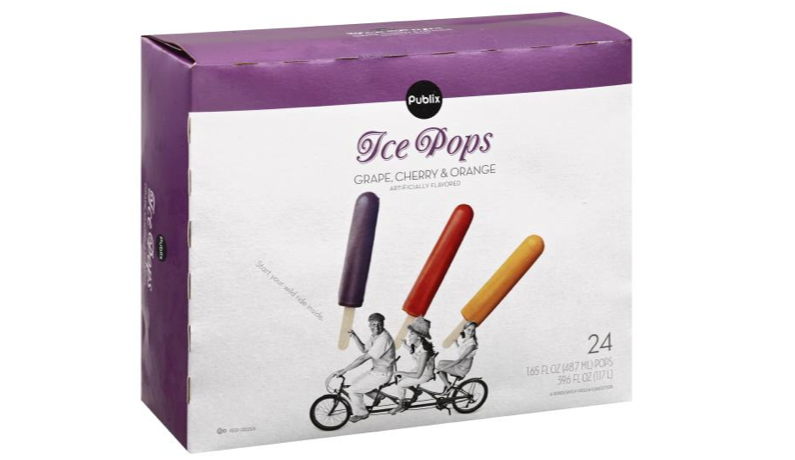
Ahhh, Publix. Publix is a large grocery chain throughout the Southeast United States. For years, Publix has been a leader in the US private label market, with well-developed brands across many categories, and super engaging design and packaging. We included two samples above from their “Premium” and “Publix” brands to show their uniqueness. High end photography, engaging layouts and simple contemporary design wins the day here. Publix private label products compare favorably not just against other private label brands, but even against most cutting-edge national brands. In fact, Publix has been so successful and innovative with their private label brands that many of them have taken on a life of their own. For instance, one of their most popular brands, Greenwise, has been incredibly popular and differentiated in the natural food category. So much so, in fact, that Publix has experimented with opening stand-alone “Greenwise Market” stores to take advantage of the brand equity and following that it has attracted. This type of brand building is extremely unique in the US market today – not to mention 5+ years ago (when Publix was leading the charge).
- < Previous 5 Designs We Love: Chips & Crisps Packaging
- Next > 5 Designs We Love: Body Wash


