5 Designs We Love: Movie Poster Designs of the 70’s

In our latest edition of 5 Designs We Love, we take a look at 5 classic movie poster designs. When we decided to focus on movie posters as a subject, it immediately became apparent that there are far too many great poster designs throughout the history of motion pictures to ever narrow them down to a list of just five. So we thought we would share some of our favorites, and separate them into individual categories.  Here are our favorites from the 70’s era.


1. Jaws (1975)
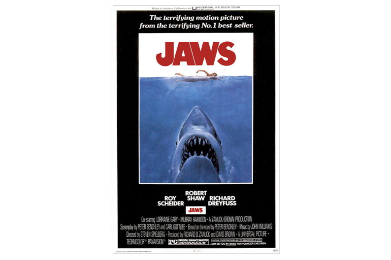
From the subtle fish hook “J” in the title treatment to the not-so-subtle shark emerging from the depths focused on his unsuspecting prey atop the ocean surface, the poster for Jaws is “Iconic” to say the least.  While the proportions of the shark are almost cartoon like, the image feels completely realistic and believable through the masterful painting of artist Roger Kastel.


2. Animal House (1978) 
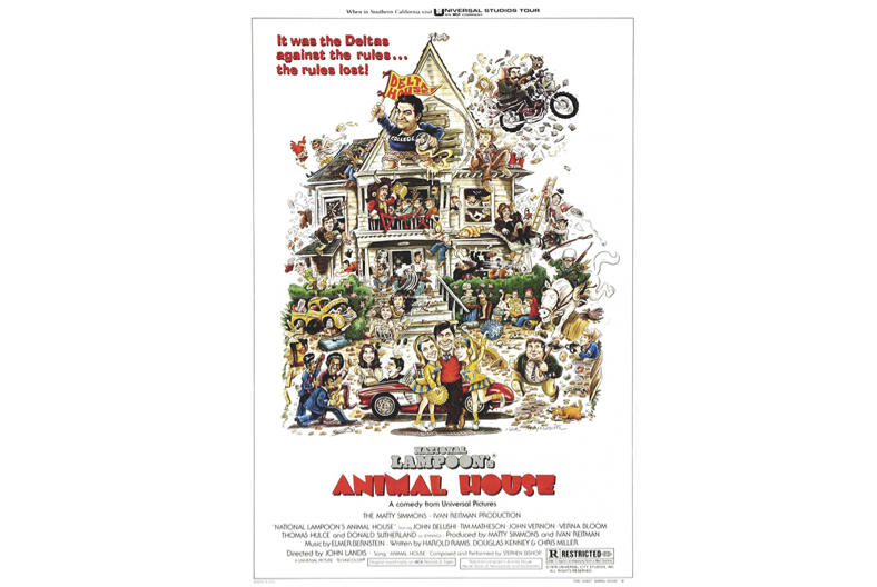
The movie poster design for Animal House can really be summed up in one word… chaos!  And it fits the film perfectly. Not only does all the wildness and fun of Delta House depicted in Rick Meyerowitz’s illustration make you want to see the movie, but there are so many points of discovery from the film that it becomes one of those images that you have to look at a second time after watching it to understand them all.  Then you want to see it again.


3. Star Wars (1977)
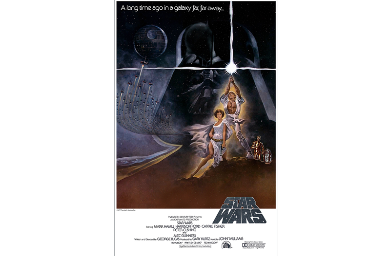
There are so many great poster designs for Star Wars, we could almost do a 5 Designs We Love just on Star Wars. However, we are choosing to focus on the original One Sheet by artist Tom Jung. The image portrays a much more glamourous and sexy depiction of Leia than we ever came to know in the movie and a muscle bound Luke we never knew either. The image effectively struck a cord in the imaginations of just about every child of the 70’s, immediately carrying them off to that “galaxy far, far away”. The most iconic element in the poster, also never seen in the film is the pose of Luke holding his light saber high above his head. This image of the design has become part of countless images, packages and logos ever since.
 
4. The Stepford Wives (1975)  
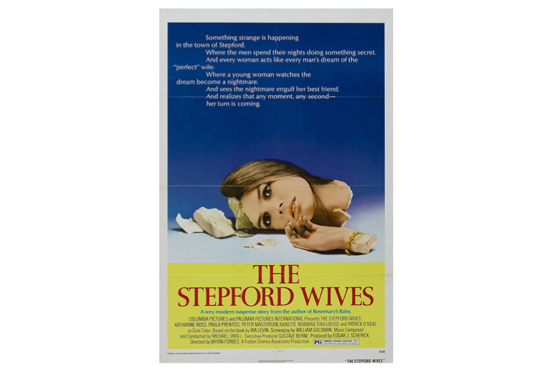
Not one you normally find on people’s all time favorite poster lists, but the poster image for the film The Stepford Wives is downright disturbing – and that’s what makes it a great poster. The movie about a group of submissive suburban housewives obsessed with housework is represented perfectly by a single image of a broken, emotionless woman. Long before the days of photoshop, the photographic image of a shattered woman made of fragile ceramic is very effectively executed.


5. Alien (1979)
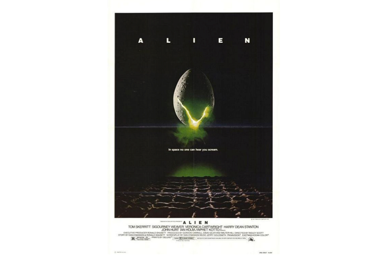
Another great example that sometimes less is more when it comes to creating a great movie poster design. From it’s simple title treatment to the quiet anticipation of what horror is about to emerge from the disturbing egg centered in the black of space, the poster does not say much but speaks volumes. Maybe most frightening of all is the tag line “In space no one can hear you scream”.


  • 5 Designs We Love: Fresh & Minimal Bottle Packaging
  • 5 Designs We Love: Classic Nintendo Game Covers