5 Designs We Love: Classic Nintendo Game Covers
March 25, 2014 - by Kory GrushkaIn today’s edition of 5 Designs We Love, we will cover the 5 most iconic designs for classic Nintendo game covers. Now, you might be wondering whether we are able to set aside our sentimental emotions for each of these games in order to truly judge the designs on their merits. And our answer to that question? Hell no. We are happy to admit that these rankings are biased, and that our long history with these classics may have influenced our opinions. That said, we think that these covers do truly stand out as not only groundbreaking designs in the category, but also designs that helped create a social phenomenon. Hope you enjoy reading as much as we enjoyed writing it…
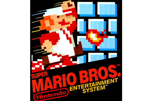
1. Super Mario Brothers 1
In the world of video game packaging and design, its hard to imagine a more iconic property than Super Mario Brothers. While the “look and feel” of this cover design wasn’t the first of its kind, it left one of the greatest impressions with fans. The same style was used on other popular classic game covers, like Duck Hunt and Donkey Kong, linking the classic games together. Released to North America in 1985, Super Mario Bros. has been repackaged many times over the years. However, the original North American box art is what most people recognize today.
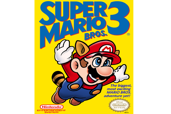
2. Super Mario Brothers 3
While Super Mario Brothers 1 set the standards for video games of its time, Super Mario Bros. 3 took on a life of its own. The updated cover showed players what they were in for and depicts Mario with the new “Super Leaf” flying powers. Introduced to the United States in 1990, the cover was significantly brighter, bolder, and cleaner than its predecessors. The use of a bold minimal yellow behind Mario created simplicity and mystery at the same time.
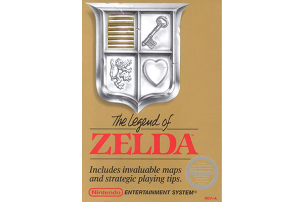
3. The Legend of Zelda
The Legend of Zelda stood apart from the rest by doing what others hadn’t yet – branding the cartridge. Along with the bright gold label, Zelda also featured a gold-colored cartridge by cutting away a small portion of the box. The gold cartridge made it easily distinguishable from the rest and ensured that fans could easily find their favorite game amongst their pile of video games. Released in North America in 1987, the tremendously popular game has sold over 6.5 million copies, making it a bestseller for Nintendo.
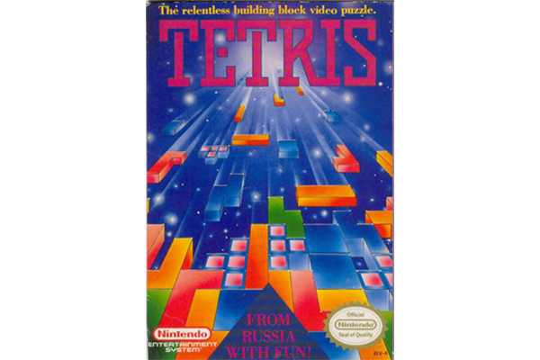
4. Tetris
The Tetris cover perfectly illustrates what the game is about and draws players in from the onset. Released in 1984, the game was designed and programmed by Alexey Pajitnov while he was working for the Dorodnicym Computing Centre of the Academy of Science of the USSR in Moscow.
5. Gradius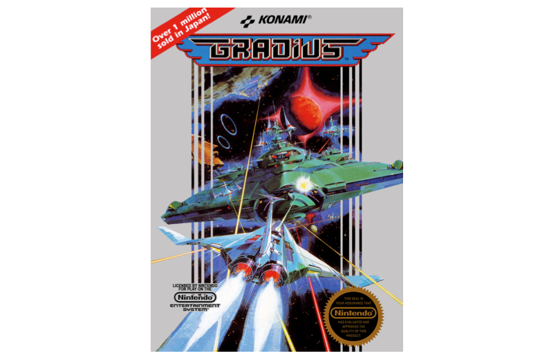
Gradius is a horizontal scrolling “shoot’em up game” produced by Konami, and originally released as a coin-operated arcade game in 1985. The cover art for the game really struck us – its a very compelling illustration of a fantasy space world that is intended to sell the excitement and depth of the game itself. That said, there is only one problem: the graphics look nothing like the cover art. This exciting illustration style reminds us of the cover art for many of the old Atari games… super realistic illustrations to depict unrealistic and pixelated video games. In any event, very pretty and enticing art that is worth highlighting.
- < Previous 5 Designs We Love: Movie Poster Designs of the 70's
- Next > 5 Designs We Love: Cereal Packaging


