
Packaging
Package Design Trend: Dramatic Callouts
May 23, 2017 - by Taylor Getler


As consumers become more resolute in their preferences for trends that have been growing over the past few years (“simple” ingredients, environmentally-friendly production practices, etc.), brands are responding by dramatically highlighting these traits in their packaging. This has proved successful for many breakout brands, and this strategy should be considered in order to show potential consumers that their needs are the primary concern of the company.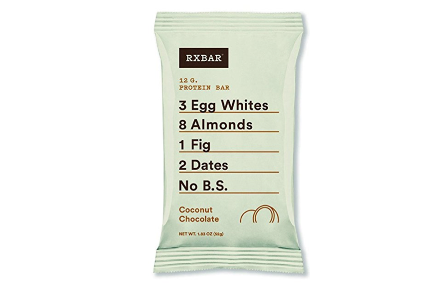 Protein bar manufacturer RXBAR took a pretty big gamble when they shrunk their logo by 60% in their 2017 package redesign. Their risk paid off enormously – by making the ingredients (which are easy for buyers to understand, a valued feature for modern shoppers) the star of the design, they launched their product into third place in its category.
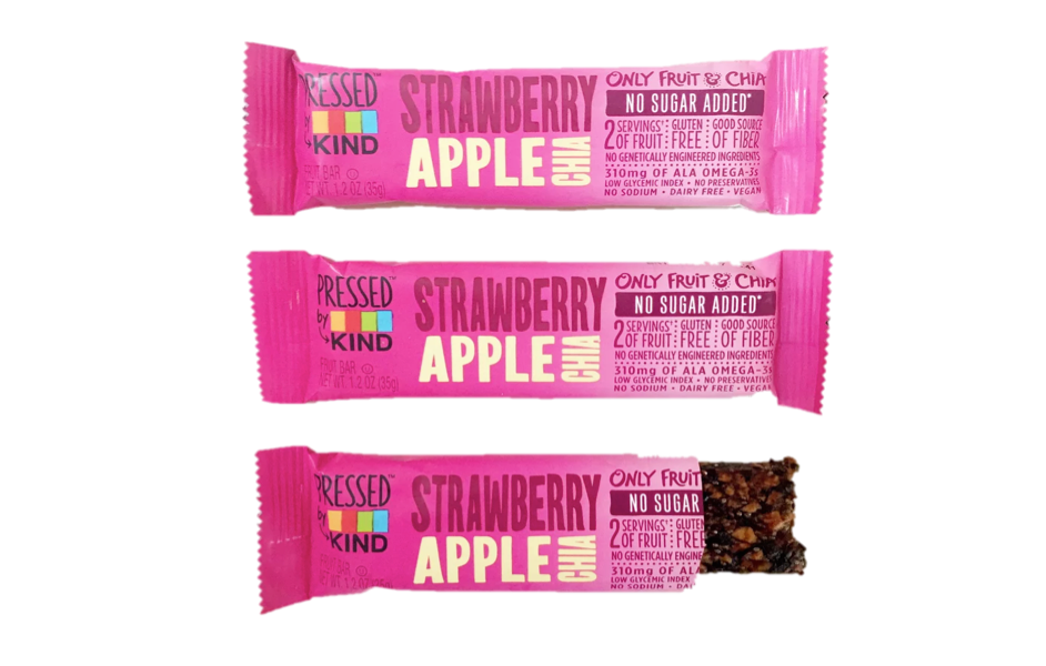 KIND chose a similar strategy with their line of pressed bars, minimizing their brand name in order to free up room for the ingredients to shine. The company states that each bar adds two servings off fruit to one’s daily routine, and that the snack is made with just fruit and vegetables or fruit and chia. The packaging callouts emphasize this “simple” makeup.
 This packaging from design agency mousegraphics reads like a recipe, taking what RXBAR has done a step further. While the funky hand-drawn typeface is a little difficult to read, the flavors are easily distinguished because whichever ingredient is most present in each bar gets a corresponding color and small illustration at the bottom. The project won a 2017 Dieline Award for Outstanding Achievement.
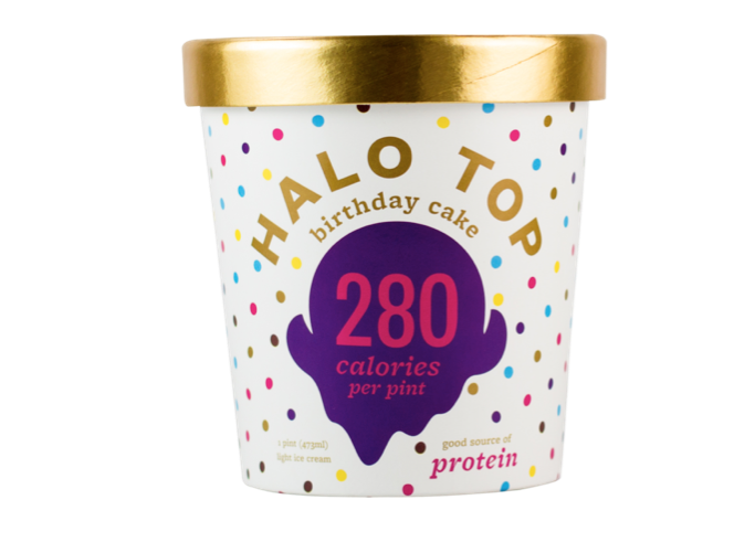 Halo Top majorly disrupted the ice cream category with its loud display of its outrageously low calorie count. The treat is made with stevia instead of sugar, meaning that the brand is able to differentiate themselves from fatty, indulgent competitors. Here, this fact is the hero of the packaging, as the calories-per-pint count is the first thing that draws the consumer’s eye.
 Water for Change, which donates 10 liters of water to villagers in need for every carton purchased, won an A’Design Award for this packaging. The hand-to-hand illustration clearly calls out the value that the product offers beyond its basic function, and floating words like “eco friendly” and “sustainable” further express the image of environmental health that the brand is trying to promote.
- < Previous The Present and Future of Alcohol
- Next > The Rise of Minimalism in Package Design