
Packaging
The Rise of Minimalism in Package Design
June 08, 2017 - by Keith Loria


The trend for minimalism in package design continues to pick up steam, be it forgoing lots of wording, using simplistic designs, going without labels, or even utilizing materials that are plain and simple.
Many companies are opting for clear-cut product labels, which allow consumers to easily identify and differentiate the brands from others on the market. In an era of information overload, savvy CPG brands are realizing that their customers appreciate minimal packaging.
Matt Ramirez, senior designer with Adhere Creative, an inbound marketing and brand development agency in Houston, Texas, said it’s strict limitations or restrictions that sparks creativity.
“Minimalism is the style of the day. Companies can still bend it to fit our needs whether we use color, typography, or simple flat graphics instead of images to stand out,” he said. “Having a roadblock forces us to think up creative ways around it. Having to stand out from the pack with less and less to work with is just another roadblock designers have to think around in a creative way.”
Marketing veteran David Miskin, CMO of Lightstone, first applied the minimalist attitude doing window displays while working at the Gap, and he’s seen minimalism rise in importance over the decades. “I think everybody is familiar with the term ‘less is more.’ It’s important to realize, though, that design is not about less or emptiness, it’s about impact,” he said. “A minimalist philosophy doesn’t just spare space; the designer works using pieces that tell a story. By focusing on what is essential, a designer can better exemplify a company’s or brand’s narrative by focusing on a few points that make a big difference.”
Looking at traditional advertising—whether it was print, television, or billboards—Miskin noted there was such a dominant design across all mediums from the ’60s to the ’80s, that it got to a point where there was so much clutter that designers needed to go to the other end of the spectrum and clean palates again, starting from the basics to develop new concepts.
“In fact, many modern offices have employed streamline, to varying degrees, using negative space to tell the story of their brand,” he said. “In addition, this approach has led to greater productivity, collaboration, and ideas.”
Going Minimalist
Some of the design elements that can help contribute to a minimalism feel include using lots of white space, bringing out a message on a small portion of the packaging; relying on bold colors and visibly appealing fonts; or using a simple photo that tells the story you want to tell.
Still, minimalism doesn’t have to be a white background with a gray apple in the middle, either. It can be an orange box with a white swoosh or even a burger made out of the simple bars of the letter “E” in the word “whopper.” All are examples of minimalism however, they use the style in very different ways.
“Color, space, shape, and typography are all very important tools we have at our disposal to make brands stand out and look different while using the same trend to communicate our message,” Ramirez said. “Having a well-thought-out brand identity is an essential tool that we must never forget about. Pepsi and Coca-Cola both use minimalism with simple packaging and on the bottles themselves. However, never in a million years could someone mix them up because they have vastly different typography, colors, and overall brands.”
Miskin said that consistency within a brand is important when pursuing a minimalistic strategy, and the elements of the minimalistic design should be across the board.
“A brand needs to know who they are and not stray too far from their formula,” he said. “By not drifting from their identity, consumers will become loyalists who seek out a brand, quickly recognizing them in a retail space.”
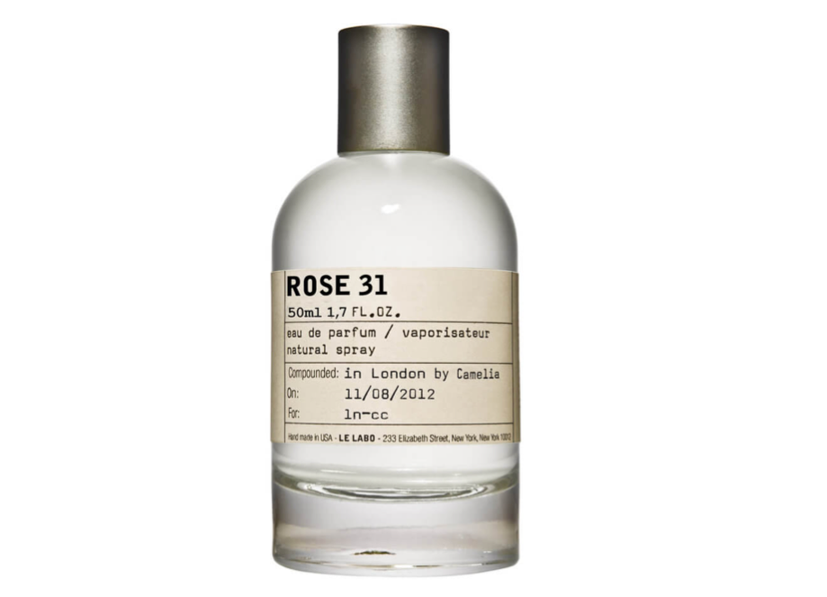
Le Labo, for example, designs all of its fragrance brands in the same way.
“If you look at their packaging, it’s consistent: minimalist across all scents,” Miskin said. “Maison Margiela is a stand-out fashion brand with minimal store build-outs and packaging. Their stores’ design features include books painted white, scraps of wood, reclaimed fixtures, and a consistent grit throughout the stores. Just by going to that white, clean place, they developed such a strong brand.”
Minimalism in Action
Another great way to get the most out of a minimalist design is to let a label make eye-catching, bold claims, such as Boxed Water, which simply has “Boxed Water is Better” written in black against a white background.
 It was a decision that company CEO Daryn Kuipers said was important to getting its message in front of consumers. Furthermore, the company put great thought into its packaging materials, again opting for a minimalist approach.
“By packaging our premium water in recyclable cartons that ship flat to our regional fillers, Boxed Water minimizes our carbon footprint and increases efficiency compared to bottled water options,” Kuipers said. “The paper for our cartons is sourced from trees of well-managed forests, where new trees are continuously planted to replace the ones harvested.”
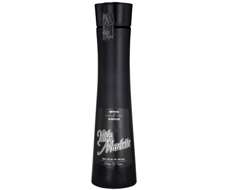
Vodka Mariette is a premium French spirit designed for bold and creative millennial women and a minimalist design was accomplished in-house by Winz Hospitality with assistance from design firm MX Landau.
“To differentiate, an antique neckless carafe was designed in a shape reminiscent of the Eiffel Tower and/or a woman’s body,” said Josh Winzelberg, Vodka Mariette’s president. “It was made completely matte black, opposed to ornate glossy or frosted bottles that are common. Rather than painted décor, a label of quality paper was opted for, similar to wines and champagnes that convey craftsmanship and class.”
Furthermore, the fonts expressed a general contrast, creating the aesthetic of the brand, which is French Modern.
“The female-oriented style of contemporary minimalism with homage to history and craft via details is truly relevant now as a hallmark for the changing landscape of luxury spirits,” Winzelberg said. “This gives the bottle a ‘fresh’ look many others lack.”
The philosophy of minimalism is to omit needless things, so by paring down packaging materials and pairing down the visual aspects of the design, a brand can do wonders and send a big message by doing what’s seen as little.
- < Previous Amazon Squares Off Against Big Box Retailers
- Next > Redesigns and Refreshes: Why Change is Crucial