Redesigns and Refreshes: Why Change is Crucial
June 16, 2017 - by Matt CannonEach year, new design trends emerge. It’s important for businesses to keep up with these changes in order to remain competitive, and those that are really good at it can even position themselves as change leaders within their industry. As our Director of Business Development, Kory Grushka, put it: “Be very curious and stay on top of the latest trends and news – particularly in your industry, but also outside of it.”
Adjusting to Fit the Times
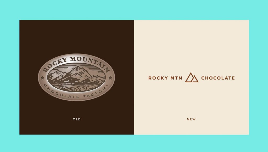
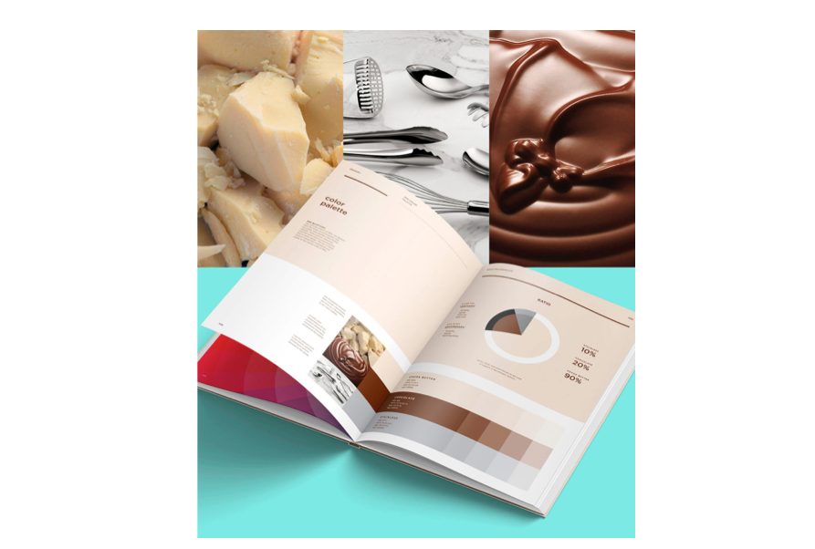


Rocky Mountain Chocolate Factory completely rebranded their packaging and store design to better fit in with today’s aesthetic style and feel. Graphic design studio, Wedge & Lever, took advantage of the new chocolate culture by giving the branding an upscale feel, with a color palette inspired by the chocolate itself.
Rebranding Efforts Often Lead to Huge Success
If a brand has become outdated, is declining in sales, or needs to stand apart from the competition, then a rebrand can provide the facelift they need to bring the right attention to the product. Rebranding also keeps customers interested and shows them that people are still hard at work behind the scenes making sure the product is the best out there.
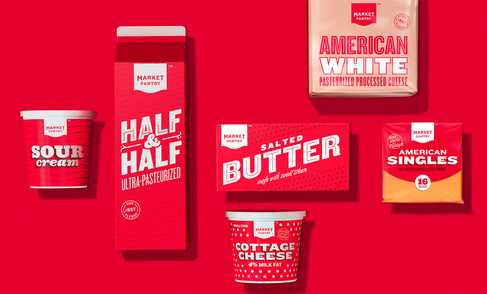
Target proved this when they updated their generic Market Pantry packaging to give it a hip, trendy vibe. It now feels like a standalone brand, rather than an affordable generic pick.
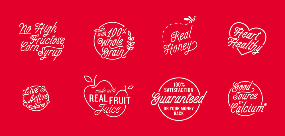
Each product has its own detailed packaging, down to the type. The heavy typography feels fresh, like something that could be seen on a Brooklyn storefront. The badges for health feel like modern stamps now, instead of boring nutrition facts or your typical callout.
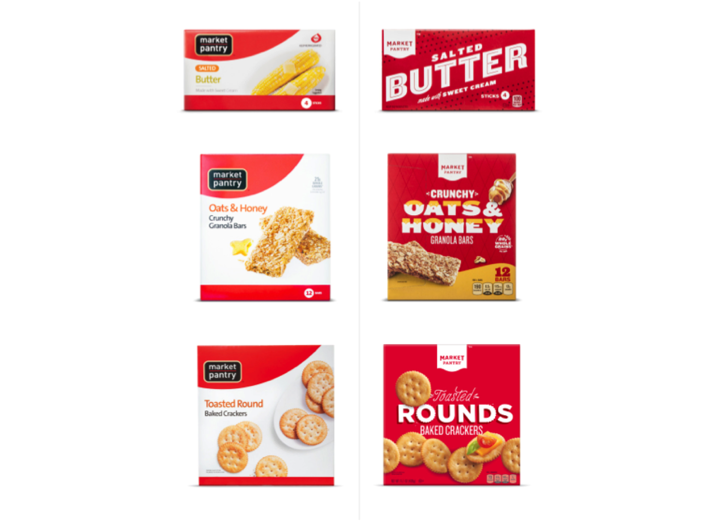

The Crunchy Oats & Honey Granola Bars now have honey dripping onto the top of the type. With the Toasted Rounds Baked Crackers, the “O” and the round portion of the “D” have treatment that feels like the edge of the cracker. The mixed fruit flavored snacks now have the typography as the teeth of smiling grapes to appeal to kids. On the Woven Wheat crackers box, the type is written so that it looks like parts are weaving in the crackers.
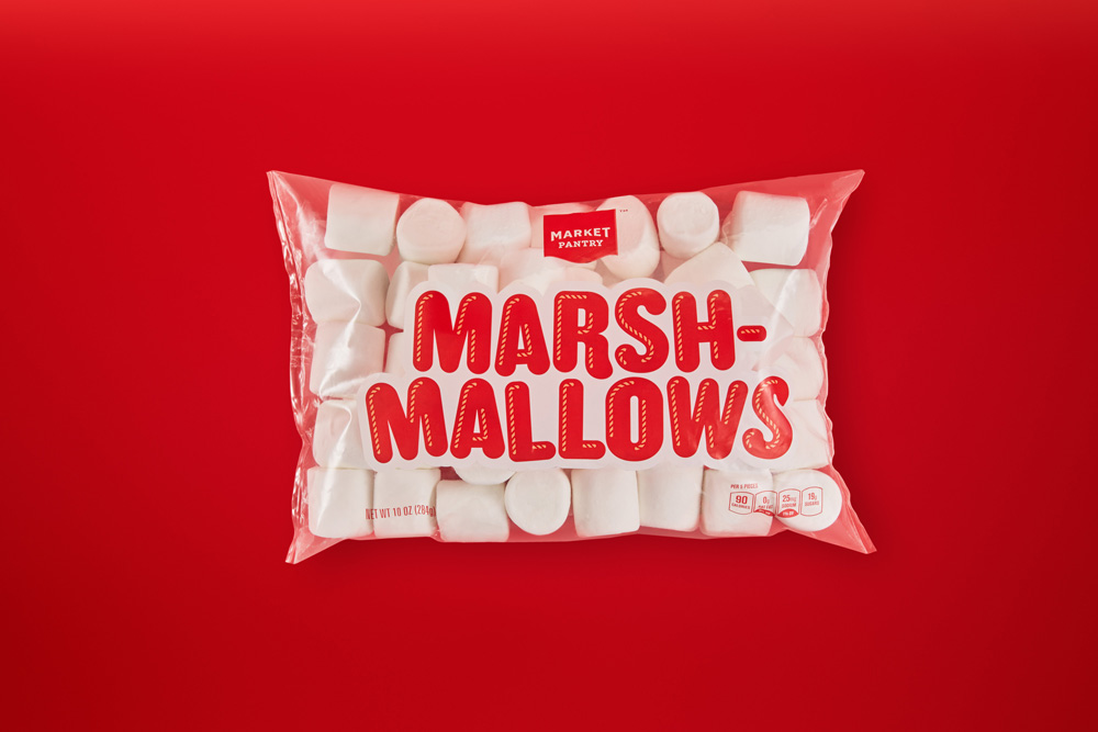
Some products (like the marshmallows) are transparent with only the logo and bold type showing, letting the product be the star of the show, and saving ink at the printer in the process. Other products, such as the butter, half and half, cottage cheese, and American singles have very flat packaging focusing on the typography alone.
Holiday Packaging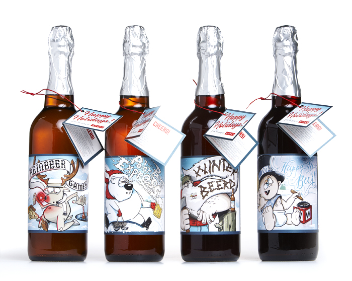
Changing packaging to fit a holiday, theme, or season can lead to huge profits. It can make your product stand apart from the competition and help build brand loyalty with your target audience.
Learn to Accept Change
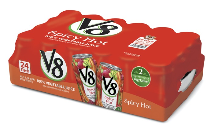
While redesigning Campbell Soup Company’s V8 packaging, our research process included multiple store visits to each of the three club store retailers, significant desktop research and interviews of club store industry experts. Further, we audited cross-category products as well as the beverage category, and conducted extensive color studies that ultimately informed the variety differentiation strategy. The final designs focused on color blocking, bold callouts for the brand, varieties and pack sizes, and photo-realistic 3D renderings of the products.
Change can be scary, and with the risks that it carries, it’s easy to see why. But with a clear vision and full understanding of trends and modernity, the resulting redesign should successfully bring a design into the present day.
- < Previous The Rise of Minimalism in Package Design
- Next > How CPG Brands are Strategizing for the Gig Economy


