5 Designs We Love: Visual Texture
June 05, 2017 - by Matt CannonVisual texturing can be used to create unique, eye-catching packaging designs, through the exploration of layers, photography, illustration, and key graphic elements. This type of design plays off of elements of touch to connect with customers on a deeper level, building both general curiosity and brand loyalty. When done correctly, textural packaging can leap off the shelves, further enticing customers (particularly those who are attracted to abstract designs).
What Is Visual Texture?
Visual texture is not quite the same as actual texture. Actual texture is something you can feel, such as wood. Visual texture, on the other hand, is only implied texture using particular styles of design, such as marbling, layered texts and graphics, patterns, colors, lines, dots, or other repeated shapes.
Caribou Coffee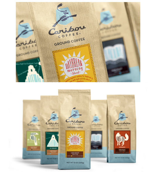
Caribou Coffee was looking for a new design that serves as “an evolution that leverages the distinct qualities of the previous packaging while incorporating new art work and design elements.” Colle + McVoy accomplished this with a burlap sack façade, which stands apart from other coffee options by simply giving the illusion of a different texture.
La Forma Saporita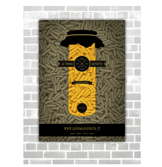
This conceptual design – created by Yanko Djarov for his final bachelor’s thesis project – deserves to be mentioned for its successful use of visual texture throughout the branding. La Forma Saporita means “the tasty shape” in Italian, which is used to inspire the branding and packaging. The textural quality of the pasta is highlighted so that the design practically jumps off the branding and packaging. The design also uses a monochromatic theme to better highlight the colors of the pasta, which is also unlike most other colorful pasta packaging on the market.
Isle of Harris Gin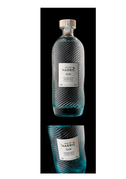
Stranger & Stranger added texturing to the Isle of Harris packaging, designed to reflect the unique colors and shapes of the landscape. It also represents a physical approach to texture design, as it entices consumers to pick it up and touch it. It stands apart without requiring a complicated (or costly) design or materials.
Lawyer’s House Wine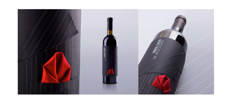
Brandient designed the new Lawyer’s House Wine packing, which serves as the perfect example of textural packaging using a simple sticker. The bottle is meant to appear like it is wearing a men’s dinner jacket using a pinstripe pattern, folded sticker, and small red handkerchief. It gives off a feeling of elegance from the shelf and is the perfect gift to take to any dinner party or client meeting.
Alternative Organic Wine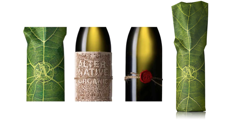
This concept created by The Creative Method offers an upscale design by focusing on the different textures found in nature. The labels use all organic packaging, from the raw twine, vine leads, and balsa wood to the inks, string, and wax used on the organic paper wrapping. Awarded the “Best In Show” at the Dieline Package Design Awards, the packaging is meant to focus on the premium nature of organic products, rather than focusing simply on the pureness of it. Along with serving as the perfect gift for any host, textural packaging designs like this one also offer a great talking point.
- < Previous 5 Designs We Love: Easter Designs
- Next > 5 Designs We Love: Sustainable Packaging Designs


